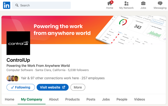
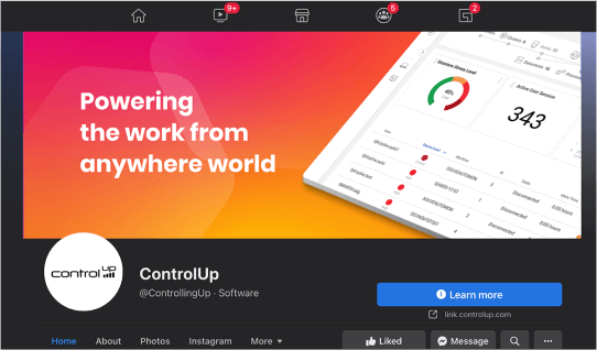
This system of foundational elements allows the ControlUp brand to stretch, while maintaining consistency across all media and print platforms.

Logo

Typography

Color

Creative element

Photography

Icons
Our logo is the number-one visual element of our identity. Proper use of the logo is vital to ensuring recognition for the ControlUp brand.
Our logo consists of two components: the symbol (graphical bars), and the company name. The symbol is a visual expression of our monitoring abilities, as well as our essence of collecting and representing the customers data.
We rarely disconnect the symbol from the company name; they are almost always presented as a single element.

Protected space is essential to keeping the logo visible and clear. The distance for any graphic object next to the logo should be no less than the height of the logo

Symbol: Chart Bars
On screen minimum size

Print minimum size

As we introduce gradients to our brand palette, we recommend using the ControlUp logo in black or white, and occasionally in grayscale or color when appropriate. Always meet a 4.5:1 minimum contrast between the logo and its background to comply with accessibility requirements. White or light neutral backgrounds are preferred, but you may also place the reverse logo on dark backgrounds.


Don’t alter the fill of the logo that has not been approved by brand.

Don’t use backgrounds with low contrast.
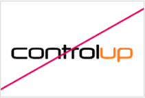
Don’t alter any elements of the logo.
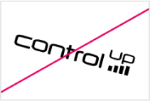
Don’t rotate the logo.

Don’t distort the length or width of the logo.

Don’t use drop shadow and/or other special effect on the logo.

Don’t add any additional text to the logo.

Don’t place the logo over busy backgrounds.
Poppins is our easy to read typeface. Poppins comes in four approved weights. However, for simplicity, most ControlUp brand assets will focus on just two font weights: Poppins Light and Poppins Semibold. The other font weights can be use on a case by case basis. Header line spacing should be set to ‘single’ spacing. Body line spacing should be set to ‘Multiple at 1.2 spacing.
Header line spacing should be set to ‘single’ spacing. Body line spacing should be set to ‘Multiple at 1.2 spacing.
abcdefghijklmnopqrstuvwxyz
1234567890(,.;:?!$&*)
abcdefghijklmnopqrstuvwxyz
1234567890(,.;:?!$&*)
abcdefghijklmnopqrstuvwxyz
1234567890(,.;:?!$&*)
abcdefghijklmnopqrstuvwxyz
1234567890(,.;:?!$&*)
Primary colors help audiences quickly identify the ControlUp brand. These are the core creative colors of our brand. Our primary colors also represent two of the three colors used in our gradients.
Secondary color highlights and compliments primary colors. This is also the third color used in our gradients.
Tertiary color is the third level of our color palette. It is not used often but can add diversity to the palette. Charts, graphs and links are examples of how both secondary and tertiary colors can be used.
Base colors are used mostly in text and backgrounds. These colors help with spacing and support primary and secondary colors.
Gradients are to be used creatively and intentionally. Don’t overuse them.
PRIMARY
RGB: 230, 0, 96
CMYK: 0, 90, 53, 10
Pantone: Rubine Red C
RGB: 255, 184, 0
CMYK: 0, 52, 90, 0
Pantone: 151 C
SECONDARY
RGB: 255, 123, 26
CMYK: 86, 49, 0, 0
Pantone: 7461 C
TERTIARY
RGB: 109, 34, 168
CMYK: 23, 53, 0, 34
Pantone: 267 C
BASE
RGB: 255, 255, 255
CMYK: 0, 0, 0, 0
Pantone: 663 C
RGB: 239, 239, 239
CMYK: 0, 0, 0, 6
Pantone: 663 C
RGB: 210, 210, 210
CMYK: 0, 0, 0, 18
Pantone: 427 C
RGB: 121, 121, 121
CMYK: 0, 0, 0, 53
Pantone: Cool Gray 9 C
RGB: 7, 7, 7
CMYK: 0, 0, 0, 97
Pantone: Black 6 C
GRADIENTS


Color usage ratio is mapped out on the right. ControlUp’s visual brand ratio should be mostly white and/or grey at 60%. Accent colors pink, yellow and orange should be used intentionally and only 30% of the time. Purple should be used very minimally at 10%. Avoid using too much color, unless it is called for.
Type and background combinations must meet a minimum 4.5:1 contrast ratio to help ensure people of all abilities can access and understand our communications.
Pick colors carefully and avoid relying on color alone to convey information. Always provide text or other graphical cues to guide audiences to our message.

Hexagon shape
When scaling to enlarge or shrink shape, make sure to keep the height width ratio the same.
Glow effect
Glow should only be applied to the hexagon with a gradient fill. It should mimic the edges of the shape’s colors. Pink edges should have a pink glow and yellow edges should have a yellow glow.
Drop shadow effect
Drop shadow should be soft and used lightly.


Here are examples of work from anywhere photography. Use photos that show diversity and aren’t too posed. The key takeaway from the images should be that people have the freedom to work from anywhere in the world. Background locations help emphasize this point.

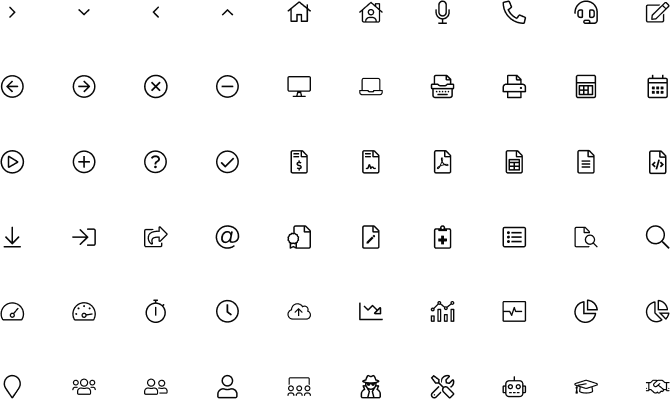
To keep a consistent look and feel of our brand, we will be using Font Awesome across all platform – Website, PowerPoint, and other graphical materials.
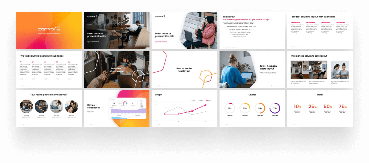
PowerPoint presentations
Whitepapers

Social media banners
Last update: January 2022
