
ControlUp recently introduced a powerful Grafana dashboard known as the Big Screen Dashboard, offering a comprehensive view of your IT environment. But what if your organization also leverages Power BI for broader data sharing with business stakeholders and management?
This blog post will guide you through the process of translating a key Grafana widget into Power BI, enabling you to bridge the gap between operational IT metrics and critical business insights. We’ll use a concrete example: transforming a Grafana widget showing average CPU usage trends over time into a dynamic Power BI visualization.
Here’s what you’ll gain by understanding this translation process:
- Combine technical operational data with business KPIs for holistic reporting.
- Embed valuable IT performance data directly into corporate reports and executive portals.
- Leverage Power BI’s advanced visualization and data modeling capabilities for richer insights.
Our Example Widget: “Desktops: Avg. CPU Usages over Time (Only Machines with Sessions)”
- Description: This widget provides a clear trend of average CPU usage for desktops with active user sessions, allowing IT teams to quickly identify CPU load patterns and potential performance bottlenecks throughout the day.
Why Translate Dashboards to Power BI?
Integrating your IT operational data with business intelligence tools like Power BI offers significant advantages:
- Unified Reporting: Present a complete picture by combining IT health with business performance metrics.
- Wider Audience Reach: Share critical IT insights with non-technical users and leadership through familiar Power BI dashboards.
- Enhanced Analysis: Utilize Power BI’s robust analytical features to slice, dice, and drill into your data in new ways.
Fun fact: Did you know you can use AI tools like ChatGPT to significantly assist with these translations, making the process even more efficient?
Step 1 — Understand the Source: The Grafana Widget’s API Call
Let’s begin by examining how the Grafana widget retrieves its data.
- Locate the Widget: In your Grafana Big Screen Dashboard, find the “Desktops: Avg. CPU Usages over Time (Only Machines with Sessions)” widget.
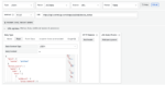
- Access Query Details: Click on the three dots in the top-right corner of the widget and select “Edit.”
- Review the Queries: Scroll down to the “Queries” section. You’ll see this widget uses a JSON query to interact with the ControlUp DAL API, specifically the
https://api.controlup.com/edge/api/dal/device_statusendpoint. - Extract the JSON Body: Click on the “Headers, Body, Request Params” button to view the complete JSON body posted to the API. Copy this JSON body and the URL – these are crucial for our Power BI query.
To dive deeper into DAL queries and their setup, consult our comprehensive documentation: https://api.controlup.io/reference/get-scoped-data-index. Utilizing the DAL API is highly recommended when creating dashboards for ControlUp for Desktops.

Handling Grafana ${} Parameters in Power BI
Grafana queries often employ template variables within their JSON structures to enable dynamic filtering and time ranges:
${devicegroups}→ Your selected device group(s)${tags}→ Your selected tag(s)${__from:date}and${__to:date}→ The time range currently selected in the dashboard${__interval}→ The bucket size for data aggregation (e.g., 1m for 1 minute, 1h for 1 hour)
For this simplified example, we’re using a static date range and no device filter. However, for dynamic Power BI reports, you can manage these parameters effectively:
- Power Query Parameters: Define
start dateandend dateparameters within Power Query. - Dynamic M Code: Replace static
'gte'and'lte'values in your M code body with these Power Query parameter values. - Group/Tag Filters: Use Power Query parameters or manual text replacement to substitute group or tag selections.
This approach allows you to build flexible, parameter-driven Power BI reports that mirror Grafana’s templating capabilities.
Dissecting the JSON Body
The JSON structure from Grafana is typically organized into three primary sections:
- Meta: Used for tracking API calls. You can customize this to “PowerBI” or remove it without affecting your query.
- Device Query: Filters the devices included in the data based on device groups and tags.
- Data Query: Defines the specific CPU data to retrieve:
- Time range:
${__from:date}to${__to:date}– These Grafana parameters will be replaced with either Power BI parameters or fixed timestamps. - Active sessions filter: Only devices with active sessions (
active sessions > 0). - CPU load existence: Only records where
cpuloaddata is present. - Aggregation: Calculates the average CPU load per defined time bucket (histogram).
- Time range:
The result is a time series representing the average CPU usage for active desktops.
Step 2 — Extract the Relevant API Call for Power BI
In Grafana, the full JSON body often includes both device_query and data_query sections. For this Power BI example, we’ll streamline the process by focusing solely on the data_query. This provides a clearer and more manageable demonstration of data retrieval in Power BI.
Basic JSON Body (for this blog’s Power BI example — no device_query):
{
  "meta": { "source": "PowerBI" },
  "data_query": {
    "size": 0,
    "query": {
      "bool": {
        "must": [
          { "range": { "_created_local": { "gte": "2025-06-09T00:00:00Z", "lte": "2025-06-10T10:00:00Z" } } },
          { "exists": { "field": "cpuload" } },
          { "range": { "active sessions": { "gt": 0 } } }
        ]
      }
    },
    "aggs": {
      "cpu_usage_over_time": {
        "date_histogram": {
          "field": "_created_local",
          "fixed_interval": "1h",
          "time_zone": "UTC"
        },
        "aggs": {
          "average_cpu_usage": { "avg": { "field": "cpuload" } }
        }
      }
    }
  }
}
Step 3 — Implement the API Call in Power BI
Now, let’s bring this data into Power BI Desktop:
- Open Power BI Desktop:
- Create a Blank Query: Navigate to
Get Data→Blank Query. - Open Advanced Editor: In the Power Query Editor, click on
Advanced Editorfrom the Home tab. - Insert Power Query M Code: Paste the following M code into the Advanced Editor: <!– end list –>
let
    url = "https://api.controlup.com/edge/api/dal/device_status",
    body = Text.Combine({
        "{",
        "  ""meta"": { ""source"": ""PowerBI"" },",
        "  ""data_query"": {",
        "    ""size"": 0,",
        "    ""query"": {",
        "      ""bool"": {",
        "        ""must"": [",
        "          { ""range"": { ""_created_local"": { ""gte"": ""2025-06-09T00:00:00Z"", ""lte"": ""2025-06-10T10:00:00Z"" } } },",
        "          { ""exists"": { ""field"": ""cpuload"" } },",
        "          { ""range"": { ""active sessions"": { ""gt"": 0 } } }",
        "        ]",
        "      }",
        "    },",
        "    ""aggs"": {",
        "      ""cpu_usage_over_time"": {",
        "        ""date_histogram"": {",
        "          ""field"": ""_created_local"",",
        "          ""fixed_interval"": ""1h"",",
        "          ""time_zone"": ""UTC""",
        "        },",
        "        ""aggs"": {",
        "          ""average_cpu_usage"": { ""avg"": { ""field"": ""cpuload"" } }",
        "        }",
        "      }",
        "    }",
        "  }",
        "}"
    }, "#(lf)"),

    Source = Json.Document(Web.Contents(url,
        [
            Content = Text.ToBinary(body),
            Headers = [
                #"Content-Type" = "application/json",
                #"Authorization" = "Bearer YOUR_API_KEY" // REMEMBER TO REPLACE THIS!
            ]
        ]
    )),
    aggregations = Source[aggregations],
    cpu_usage_over_time = aggregations[cpu_usage_over_time],
    buckets = cpu_usage_over_time[buckets],
    #"Converted to Table" = Table.FromList(buckets, Splitter.SplitByNothing(), null, null, ExtraValues.Error),
    #"Expanded Column1" = Table.ExpandRecordColumn(#"Converted to Table", "Column1", {"key_as_string", "key", "doc_count", "average_cpu_usage"}, {"Column1.key_as_string", "Column1.key", "Column1.doc_count", "Column1.average_cpu_usage"}),
    #"Expanded Column1.average_cpu_usage" = Table.ExpandRecordColumn(#"Expanded Column1", "Column1.average_cpu_usage", {"value"}, {"Column1.average_cpu_usage.value"})
in
    #"Expanded Column1.average_cpu_usage"
Important: Replace YOUR_API_KEY with your actual API key.
Notice that we’ve used a fixed time interval along with specific start and end dates in this example. For production environments, you’ll likely want to replace these static values with Power BI parameters for dynamic date range selection.
From here, you have the flexibility to visualize your data within Power BI in any way you prefer. The Grafana widget uses a Time Series chart; you can easily replicate this in Power BI using a Line chart, and then further enhance it with Power BI’s extensive formatting and interactive capabilities.
Extra: Leveraging AI to Streamline Dashboard Translation
Tools like ChatGPT can be incredibly valuable in accelerating the translation of Grafana dashboards to Power BI. Here are some key benefits of integrating AI into your workflow:
- Automated M Code Generation: Prompt AI to generate Power Query M code directly from your Grafana JSON, saving significant manual effort.
- Complex Aggregation Explanation: Get plain-language explanations of intricate JSON aggregation structures.
- Best Practice Suggestions: Receive recommendations for flattening nested JSON structures and optimizing your data model in Power BI.
- Visualization Guidance: Get assistance in converting Grafana time series data into appropriate Power BI line charts and other visualizations.
A Recommended AI-Assisted Workflow:
- Paste your Grafana JSON into ChatGPT.
- Ask a clear prompt: For example, “Generate a Power Query M script that performs this query to retrieve
average_cpu_usageandkey_as_stringfor a time series chart.” - Review and Refine: Carefully review the generated script. Adjust it as needed to fit your specific Power BI environment and data modeling requirements.
Summary
By following this method, you can efficiently translate valuable IT operational widgets from your ControlUp Grafana dashboards (including the Big Screen Dashboard) into comprehensive and shareable Power BI reports. This empowers your organization with deeper, unified insights, bridging the gap between IT performance and business outcomes.