
For remote- and office-based employees alike, meeting virtually with Unified Communications tools like Microsoft Teams and Zoom has become the standard for communication and collaboration. These solutions are now among the most mission-critical business applications and the lifeblood of corporate communications; we use them to share important information, as well as to simply keep in touch with our coworkers, customers, or anyone else we interact with—whether they are in the cubicle next to us or halfway around the world. With that in mind, we’re proud to announce that Edge DX—our physical endpoint monitoring solution—can now monitor Unified Comms applications!
Gaining insights and the ability to report on how people use these tools—including the number, duration, type and attendee participation for calls and meetings—is important for IT teams and business leaders to understand and help improve employee productivity.
Quickly pinpointing what caused poor call quality and meeting failures requires line of sight into the Unified Comms platform, all the way down to the client application running on the physical endpoint device and the network it’s connected to. IT teams must be able to drill down from the meeting into connected devices to find the source of any problem, so they can quickly resolve issues and get employees back to doing the work they want to do.
To address this need, we’ve introduced Unified Communications and Collaboration (UC&C) dashboards to Edge DX. In this article, we will demonstrate the power of these new features by highlighting a few key ways they can help in our day-to-day activities.
NOTE: These features are currently only available for Teams, but we’ll soon have Zoom and WebEx in beta, so keep your eyes peeled for those!
ControlUp’s intuitive Unified Communications dashboards give IT teams quick insights into the number of calls and meetings, their duration, user experience scores, quality and feedback, call types, plus attendee participation with customizable timeframes and filtering capabilities. They provide digital experience scores for UC solutions, which include factors like audio, video, and screen sharing quality. Additional data, such as end-user meeting sentiment provides a complete picture of the call quality.
And what’s really great is that ControlUp’s Unified Communications monitoring is simple to use.
How It Works
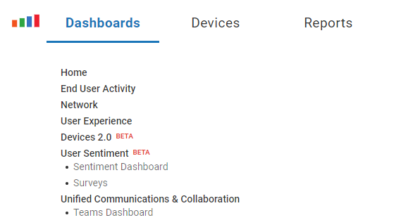
To access Teams information, select Teams Dashboard under Unified Communications & Collaboration in the Dashboards drop-down menu.
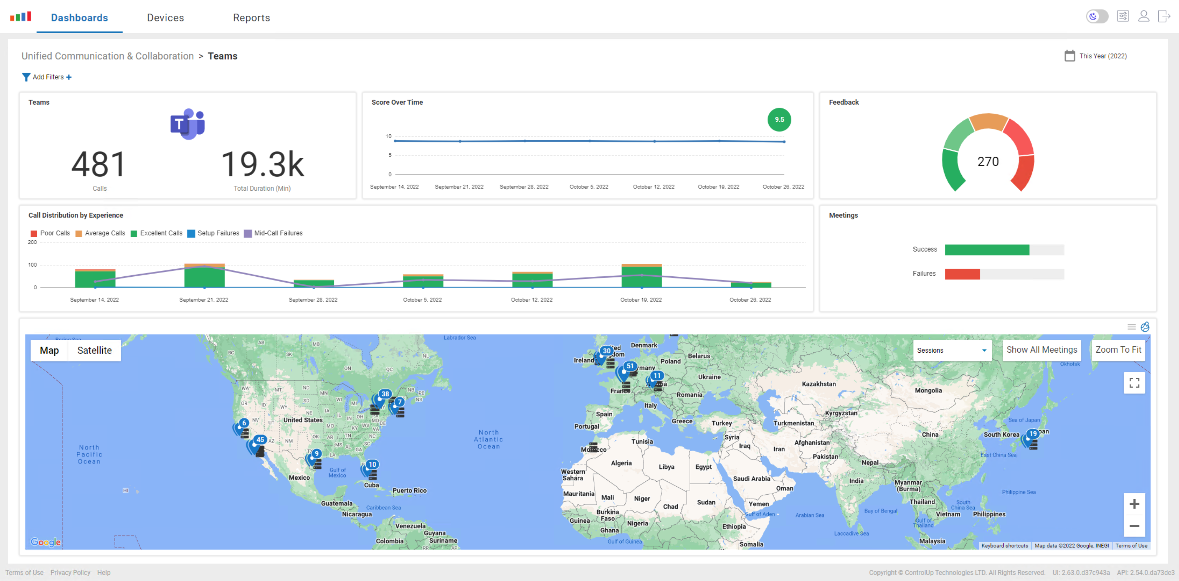
From the Teams home dashboard, you can get an overview of Teams calls over the past day, week, or month.
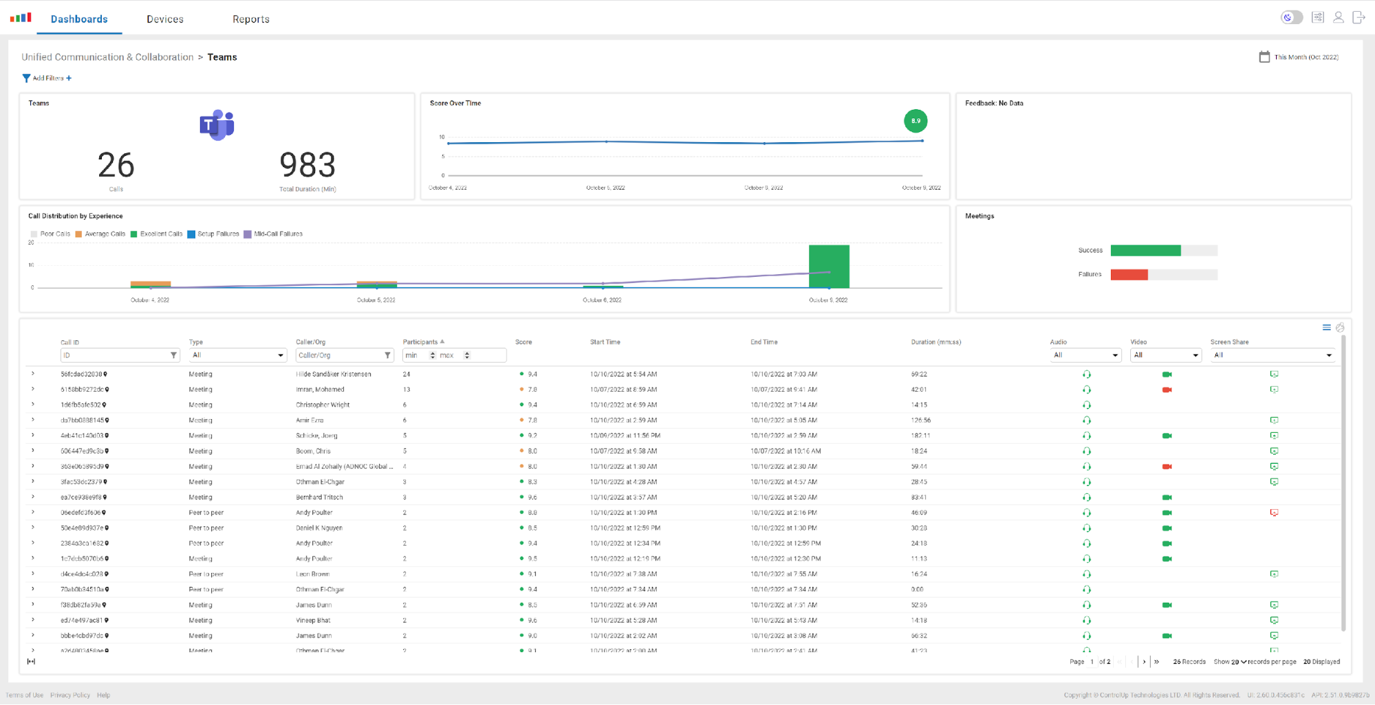
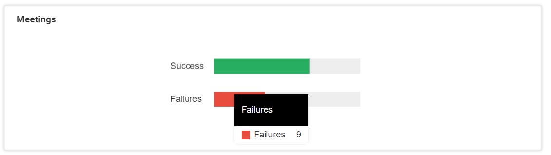
The dashboard is color-coded, so you can easily spot issues with problematic calls. For example, in the Meetings widget screenshot below, you will see that nine out of 37 calls we had this month failed.
The column in the grid view is searchable and sortable. If a particular user is having an issue, you can enter their name in the Caller / Org field.

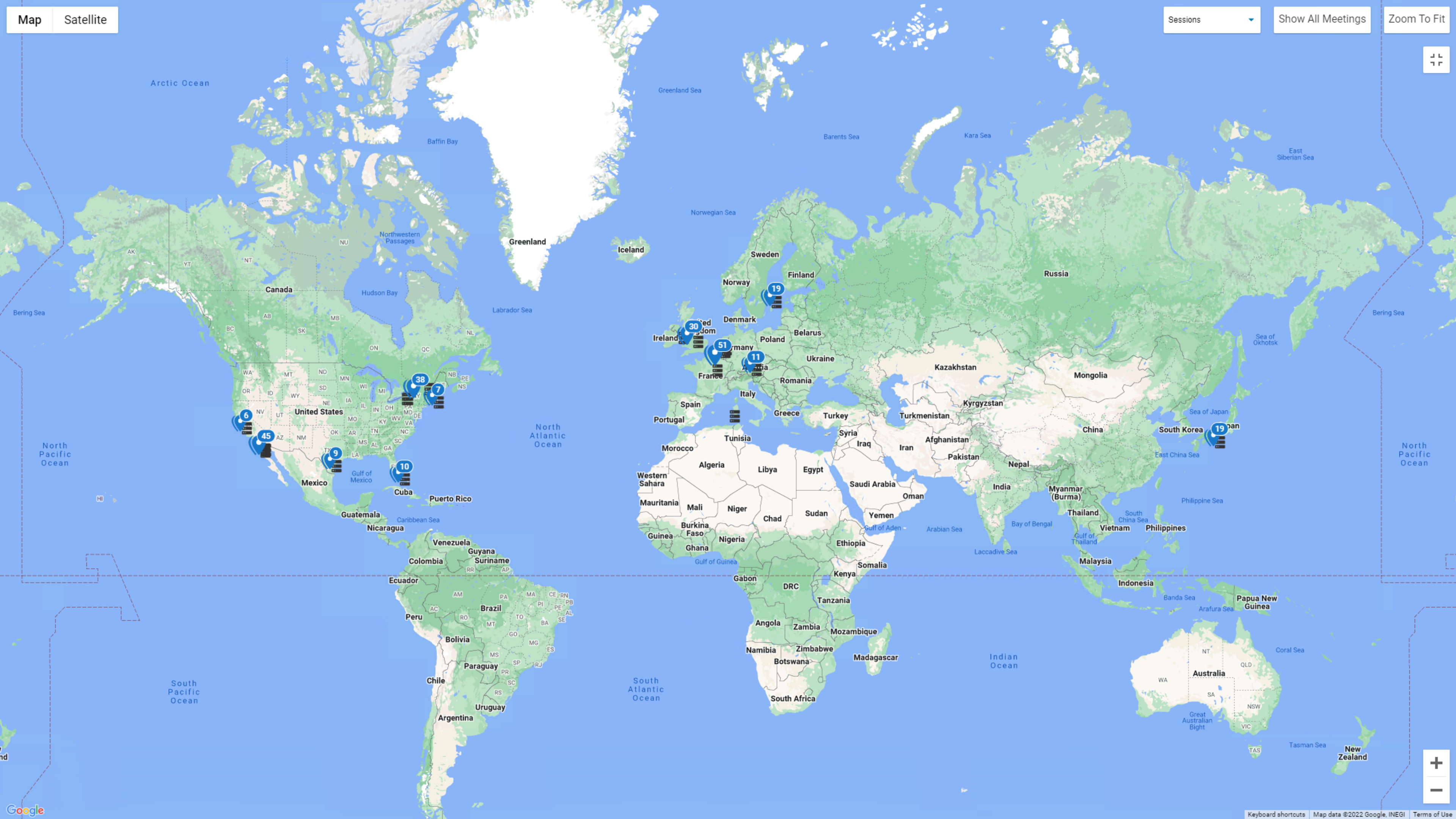
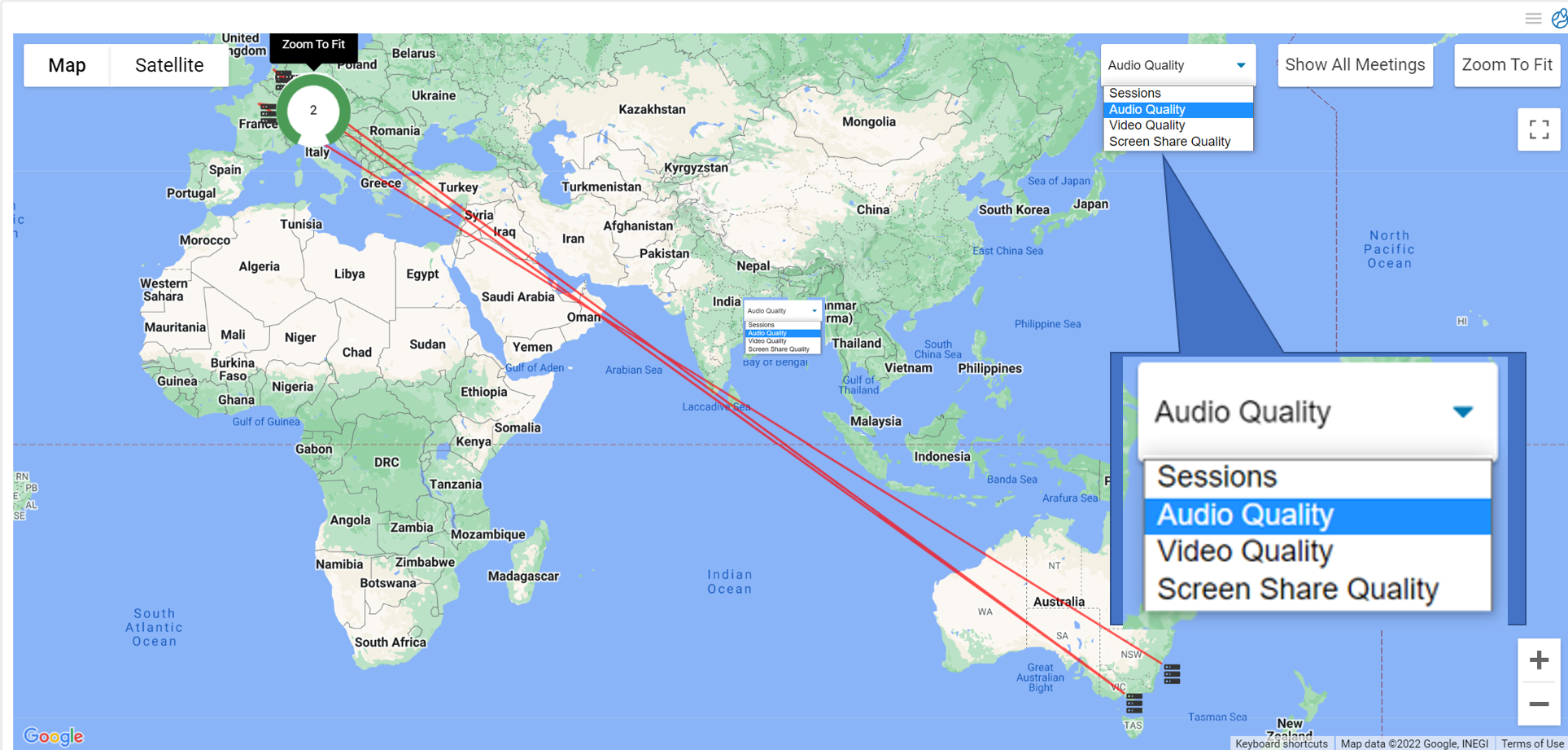
If you click the pin to the right of a particular Call ID, it will display the location of the participants in the meeting and the location of the Teams servers. This information can be useful when examining networking issues from a global perspective. From the drop-down menu, you can also select other types of information that you’d like to display on the map, such as audio, video, and screen-share quality.
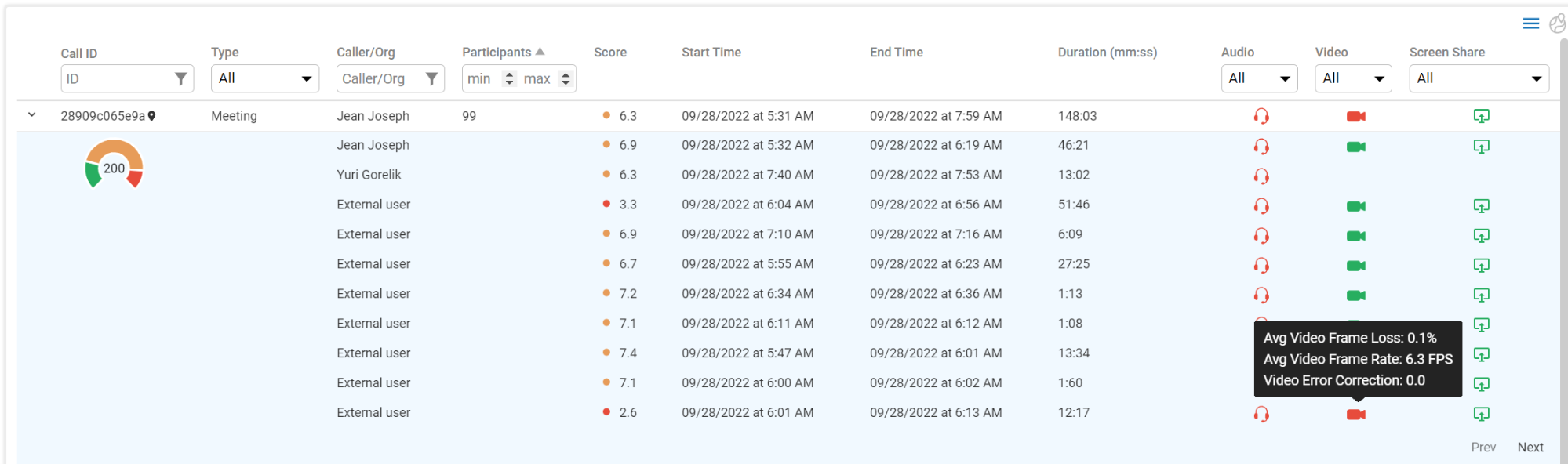
By clicking the expand icon for a particular session, you can get the full details of the callers and the experience they had during the call. Color-coded icons make it easy to spot callers experiencing problems, and you can hover over an icon for more information. In the example below, we can see that, as indicated by the abundance of red headphone icons, many of the participants in this meeting had audio issues.
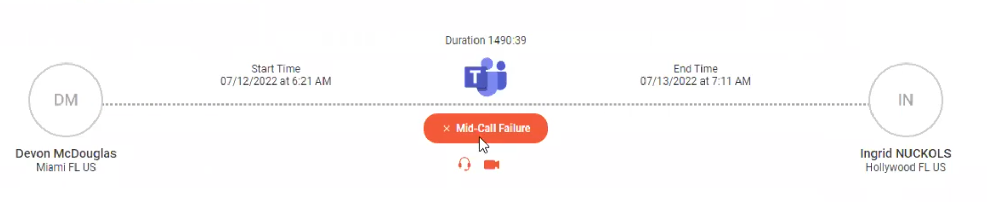
By selecting the specific failed call in the screenshot below, we can see that the caller had a wired connection and that the callee had a Wi-Fi connection with a 53 percent signal strength. We can also see that this call had a mid-call failure.
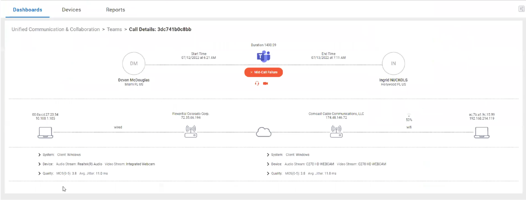
By drilling down even further into the call, we can see how the callee’s mean opinion score (MOS) dropped to zero at certain times.
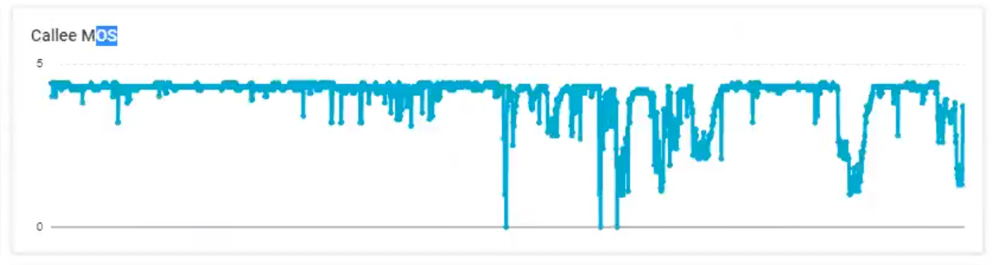
The MOS is an interesting metric, as it attempts to quantify the user’s experience with audio and video. This experience is highly subjective since people perceive these factors differently, so the MOS is an algorithmic approximation of this experience, ranging from a numeric value of 5 (best) to 0 (worst). The history and debate surrounding the usefulness of MOS is fascinating, but I have personally found that it is generally a good predictor of a user’s experience with UC&C applications.
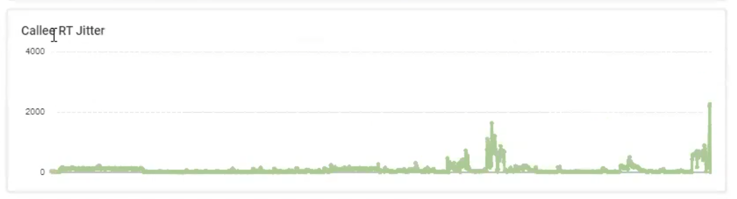
We can also see that these users had some issues with jitter. When network packets don’t come in the same order in which they were sent, they are stored in a buffer and then reassembled in the correct order. Jitter is commonly an indicator of network issues that manifest themselves with slowed-down or sped-up audio and video during a call.
While the graphs above validate the fact that the user had some issues, we need to know why; this is where the holistic aspect of Edge DX proves valuable.
In sum, monitoring and improving the user experience for unified communications solutions must be a top priority for IT teams, because when people have issues with them, productivity will be immediately impacted and frustrations will inevitably rise (for both end-users and IT alike). With ControlUp, IT has the tools they need to keep everyone happy and productive.