
Recently, a system engineer (SE) asked me if it was possible to use ControlUp Insights to monitor the individual and average CPU usage of Horizon virtual desktops on a specific node.
Though Insights shows usage for individual desktops, it doesn’t have an official mechanism to display the average usage for multiple desktops. It is, however, able to export its data for further analysis. This is just what my SE friend was looking for.
With ControlUp Insights, running a report like this is a snap. Here’s how you can use ControlUp to capture the CPU usage on multiple desktops and then export the data to a spreadsheet and graph it for visualization.
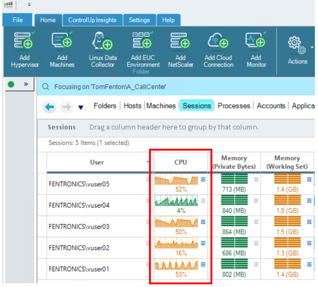
To get started, I used the ControlUp Console to examine the systems, and noted that each exhibited unique CPU usage patterns.
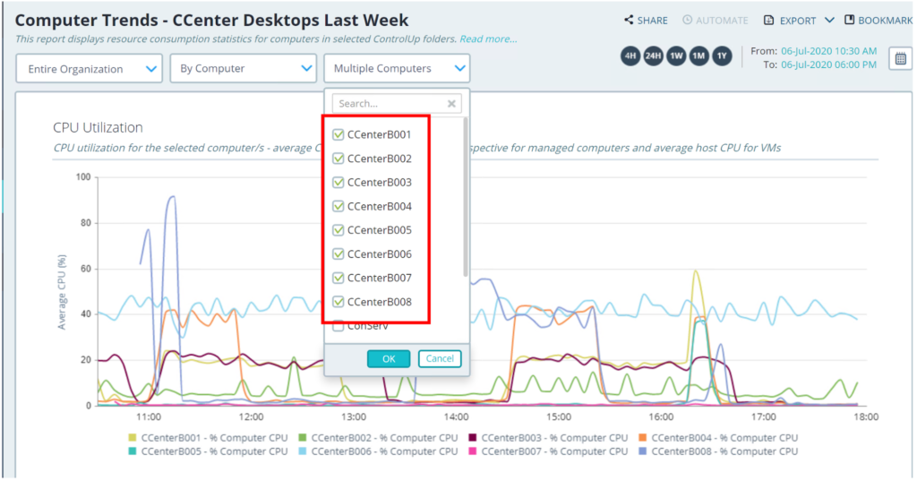
From there, I logged in to ControlUp Insights, and selected Computer Trends under the System Health drop-down menu. Then, from the Select Computers drop-down menu, I selected the desktops that were on the node I wanted to investigate.
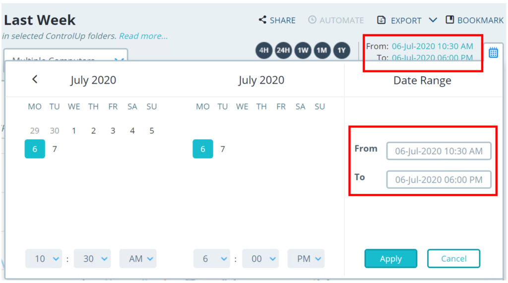
I used the time widget (located in the upper right corner of the screen) to customize the time range for the data I wanted to examine.
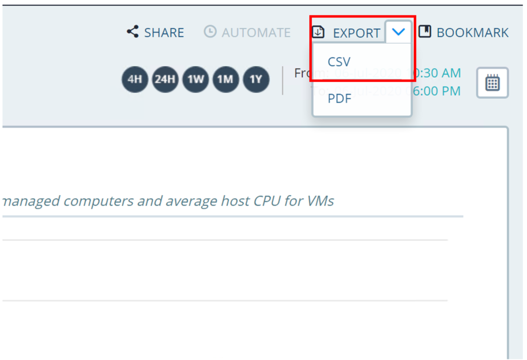
From the Export drop-down menu, I selected CSV and saved the file. The file was saved as CU Insights – Computer Trends.csv, which I used to create a workbook in Excel.
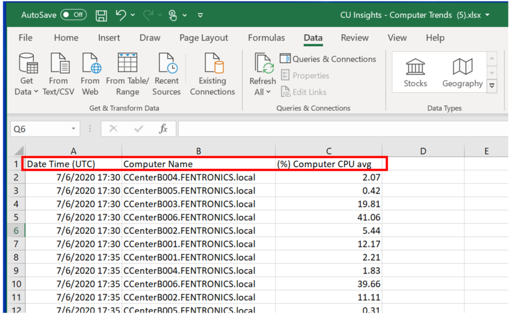
In my Excel workbook, I deleted all columns except Date Time (UTC), Computer Name, and (%) Computer CPU Avg., since I was only interested in the CPU use of the machines.
There are lots of ways to create graphs in an Excel spreadsheet, but the easiest (at least for me) is to create a line chart with multiple columns of data.
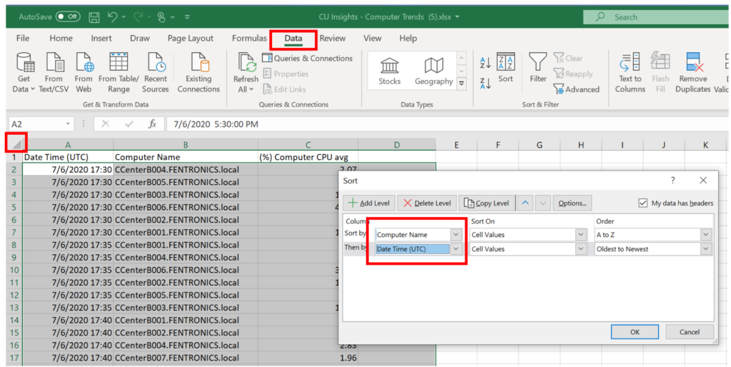
To sort the data by the Computer Name and Date Time (UTC) columns, I highlighted all the data within the spreadsheet, then clicked the Data tab, clicked Sort, selected the columns that I wanted to sort by, and then clicked OK.
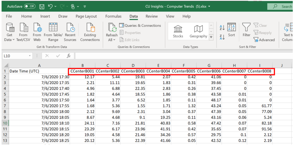
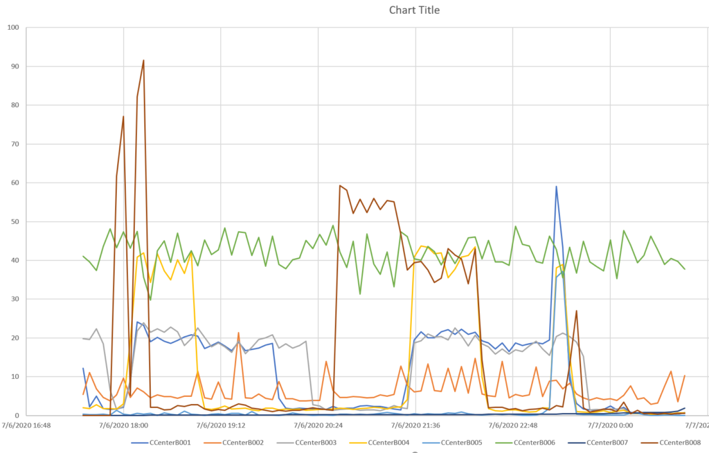
I cut the CPU usage from the computers and created separate columns of data for them; this put the CPU times for all three computers on the same time-based row. I headed the columns with the names of the computers and deleted the Computer Name column.
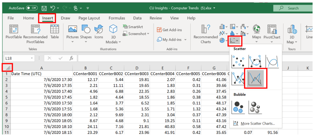
Now that I had the data separated into time-based rows, I created a line graph from it. To do this, I highlighted the data within the spreadsheet, clicked the Insert tab, and selected Scatter with straight lines from the Scatter drop-down menu.
This created a line graph from the data.
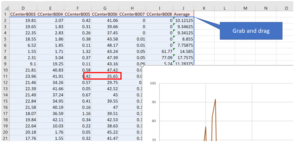
I added an additional column to the spreadsheet to calculate the average CPU usage. I added this column to the graph by selecting the graph and then dragging the handle on the data to include the additional row.
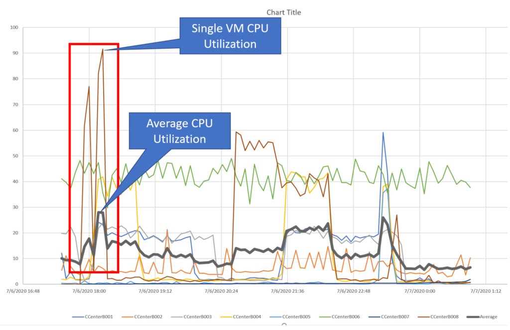
The average chart line showed that even though there were spikes and pauses, the average CPU use was somewhat consistent. If you look closely at the chart, you can see that though one of the VMs reached over 90% use, the average at that time was less than 30%. Since it is unlikely that different virtual desktops will require CPU usage at the same time, determining this average is very important for allowing the overcommitting of VMs, which, in turn, allows the host CPU to be used fully.
ControlUp Insights is an important and powerful data analysis tool, and its ability to export data provides the ability to manipulate that data in a wide variety of ways to gain further insights into your environment.