
Prevent Tickets: Devices Averages Dashboard
Helpdesk managers and frontline support professionals share a common goal – increasing the end user’s satisfaction. To accomplish this, managers need the ability to see aggregated information about all devices while support professionals need the capability to solve problems on individual devices. Edge DX’s Devices Averages dashboard (Figure 1) is a tool that provides valuable information for both groups to help with prioritizing work and spotting trends impacting the devices.
The Device Averages dashboard, like all other Edge DX dashboards, can be accessed from within the Dashboard tab.
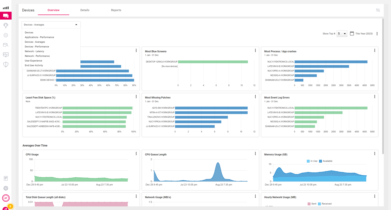
Figure 1: Device Averages Dashboard
This dashboard is divided into two sections. The top section of the dashboard lists the devices with the most problems, and the bottom section shows aggregated information about the overall performance of all the devices. In the upper left of the dashboard has icons that you can use to customize the time range you want to investigate and how many individual devices you would like to display in the widgets on the dashboard.
The screen capture below (Figure 2) shows the 5 devices with the most application and process crashes. This chart shows that one device had over four thousand application crashes in the past year! Obviously, support professionals should investigate why this device is so prone to crashing; perhaps the device has hardware that is starting to fail or an application or OS that needs to be patched.

Figure 2: Devices with the Most Application Crashes
Clicking the chart bar of a particular device will bring up its home page (Figure 3) with more specific data so it can be investigated further.

Figure 3: Device Home Page
By doing a quick review of the device’s metrics, we can see that it has reached 100% CPU utilization multiple times and had a CPU queue length of 463 (Figure 4) at one point. It’s obvious that this device was being heavily overworked.

Figure 4: Devices CPU Metrics
By hovering over the point where it was at 100% utilization, we can see that a WMI Provider service (WmiPrvSE.exe) process (Figure 5) is consuming an abnormal amount of CPU cycles (Figure 5).

Figure 5: Process List
In this example, we were able to identify a problem with just a few clicks, and then identify the root cause with just a couple more clicks.
Other widgets that help organizations to prioritize their work are Most Blue Screens, Most Event Log Errors, Most Missing Patches, and Least Free Disk Space (%).
Managers may want to print out a CSV file from the Worst Battery Health (%) widget so they can assess if this is of concern so that, if needed, they can start the process of ordering new batteries for these devices or look into retiring the devices.
Higher-level managers should concentrate on the Averages Over Time widgets (Figure 6) at the bottom of the dashboard as this shows trends for all devices being monitored by Edge DX.
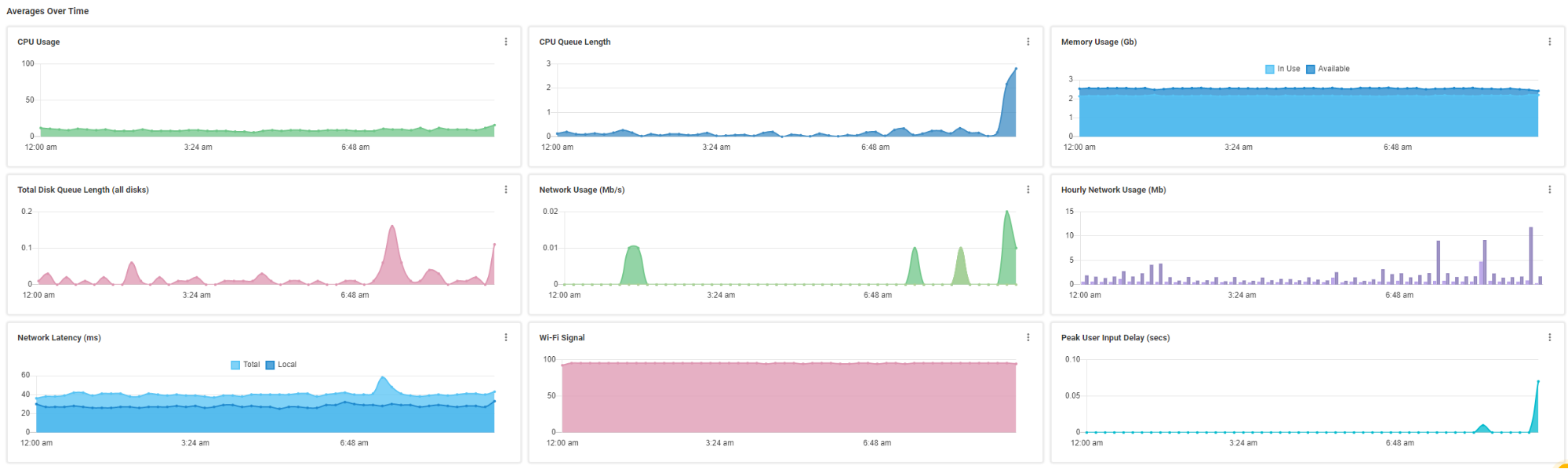
Figure 6: Averages Over Time Widgets
To get a better overall feel for the environment, I increased the time range (Figure 7) to the past two months.

Figure 7: Averages Over the Last Two Months
This data revealed some interesting insights. For instance, the spike in CPU usage (Figure 8) at the beginning of last month was due to a new application being rolled out which had a bug in it. Once the defect in the code was corrected, the CPU usage resumed to normal.

Figure 8: CPU Spike
The other widgets in the Averages Over Time section can likewise allow you to gain insights into the overall health of your environment.
Whether you work as a support specialist or a high-level manager, the Devices Average dashboard is a good place to help prioritize your work or spot disturbing trends. A video of these features can be found here. For more information, be sure to visit ControlUp’s website or schedule a demo with a ControlUp sales engineer.