ControlUp for Desktops is a proven tool that allows help desk professionals to close tickets faster or, in many cases, avoid problems altogether. Still, it also allows higher level introspection that upline managers can use to do real-time assessments of the health of an organization’s endpoint devices. Currently, Edge DX has three new dashboards that allow insights into the applications running on a corporation’s devices, networking, and resource utilization.
Application Performance Dashboard
A company’s IT department’s primary goal is to run applications as effortlessly and efficiently as possible. All its other functions support this goal. Edge DX enables IT to monitor their applications with an Application Performance dashboard accessed by selecting it under the Dashboards drop-down menu (Figure 1).

Figure 1: Dashboard Drop-down Menu
The top of this dashboard shows, in the aggregate, the overall health of the applications, while the bottom of it shows specific problem areas.

Figure 2: Applications Performance Dashboard
By default, the widgets in this dashboard show information about all the applications running on the endpoint devices in your organization. Still, you can key in on a specific application using the Selected Processes drop-down menu.
The first row of data on the dashboard shows users’ time in applications defined as business or non-business related. The customer establishes this classification, and due to privacy and other concerns, the collection of this information can be disabled.
Applications require CPU cycles to perform their duties. You can view the CPU Hog Processes Over Time widget to gain insight into the applications that may be overconsuming resources. Hovering over a data point in the widget (Figure 3) will display a list of the top five processes using the most CPU cycles.
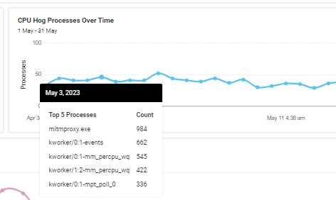
Figure 3: CPU Hog Processes
Applications cost money – directly and with the resources they consume. By hovering over a point in the Unique Foreground Windows Over Time widget you can see the top five applications allowing IT managers to understand what end-users are using applications.

Figure 4: Most Used Applications
The next row of widgets (Figure 5) shows key application insights such as resource hogs, application launch time, and, importantly, application crashes.

Figure 5: Application Insights
Clicking the widget’s name will bring up a detailed list (Figure 6) of data for that widget. This information gives more insights into the applications in an environment.

Figure 6: Detailed List
The Applications by Frustration widget (Figure 7) is less intuitive to understand than the other widgets on this dashboard. It is a metric based on how often an application crashes and the input delay for that application. The color coding for the quadrants indicates how often an application runs and how often it causes issues. Applications shown in the blue quadrant are infrequently used and have few issues, while those in the red quadrant are used frequently and often cause problems. Managers will want to investigate the applications in the red quadrant first. Like the other widgets on this dashboard, you can get more information about the widget if you pick the information icon.

Figure 7: Frustration
Closely associated with the frustration score are the widgets that show the process and devices with the most crashes (Figure 8) to help align your IT help desk resources with addressable problems.

Figure 8: Crash Widgets
If you look at the screenshot of the Top 5 devices with the Most Process Crashes widget, you will see that the top two devices have way more crashes than the others listed. By addressing the problems on these two devices, the number of help desk tickets are reduced substantially.
Network Performance Dashboard
A company’s network is arguably one of its most crucial resources, and it’s essential for middle and upper management to be familiar with the network’s health that its users rely on and to spot trends that may affect them. Spotting trends early allows issues to be addressed before they affect users and will prevent unneeded tickets from being opened. Edge DX’s Network Performance dashboard (Figure 1) gives them a powerful tool to do just that.
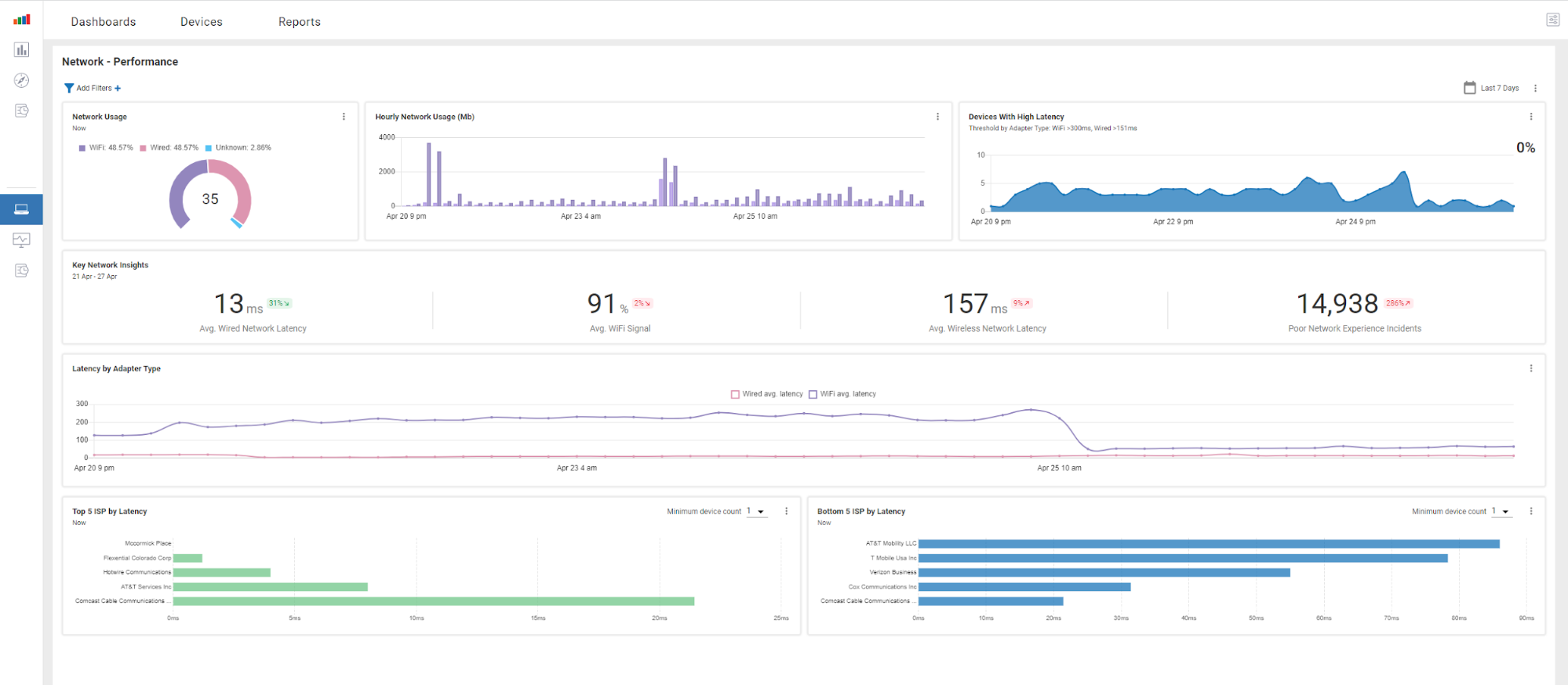
Figure 9: Network Performance Dashboard
Like all other Edge DX dashboards, this dashboard is accessible from within the Dashboard tab.
This dashboard and the Network Latency dashboard have widgets that track each device’s latency to a known network location. It then aggregates these results and displays this information by device ISP. It also shows the devices with the longest traceroute, and the overall Wi-Fi signals for the devices.
The network locations devices test against are set by selecting Setting in the Configuration drop-down menu (Figure 2) and then opening the Network Latency tab allowing each tenant to specify the most important locations.

Figure 10: Settings
The dashboard is divided into four sections; the top section has widgets displaying what percentage of devices use wired or Wi-Fi, the hourly network usage, and the percentage of devices experiencing high latency. This is a good indicator of the overall health of the network and makes it easy to spot any catastrophic trends in the overall health of the network.
The screen capture below (Figure 3) illustrates that in the Devices With High Latency widget, the number, not the percent, of devices with high latency is expressed on the bar graph. At the same time, the percentage is displayed as a numerical value in the widget’s upper right.
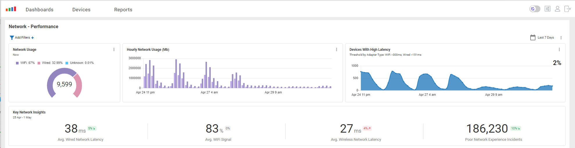
Figure 11: Devices with High Latency
The next row of widgets (see screen capture above) breaks the information of the row above it down into a more granular fashion to give deeper insights into the device’s networking by showing the average Wi-Fi signal strength, wired and wireless latency, and the number of poor network experience incidents.
The third row complements the second row of widgets by showing a graph of time of the wired and Wi-Fi latency (Figure 4) over time. This graph makes it easy to spot trends or anomalies in network connectivity.
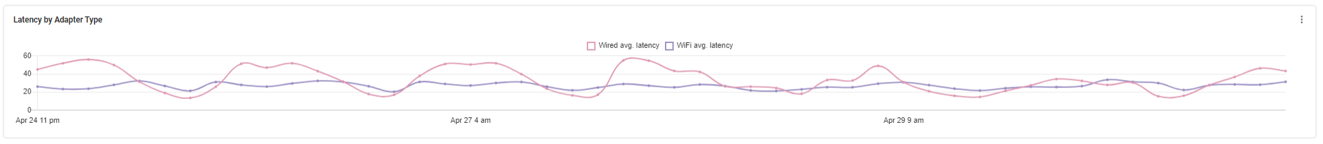
Figure 12: Wired vs Wireless
The bottom row of data tracks aggregates and displays the latency by ISP. It shows the top and bottom five performing ISPs (Figure 5). You can exclude ISP vendors with just a few devices using the Minimum device count drop-down menu.
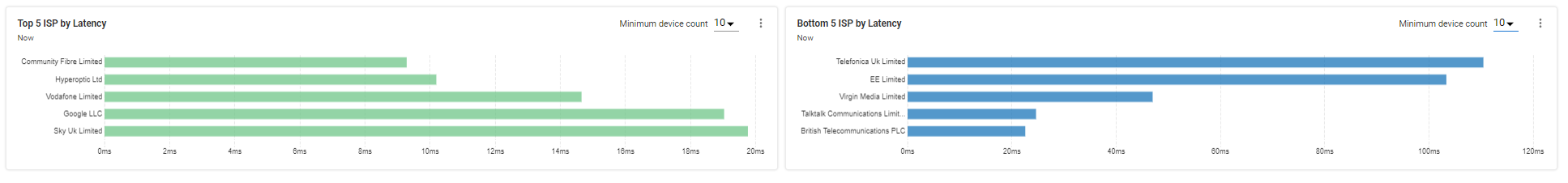
Figure 13: ISP Performance
Use caution with the ISP latency, as some providers may be wireless or satellite carriers and will have greater latency than land-based ISPs.
Because networking issues can significantly disrupt work, Edge DX’s Network Performance dashboard is a handy tool to monitor aggregated networking information. To see a video of this in action, click here.
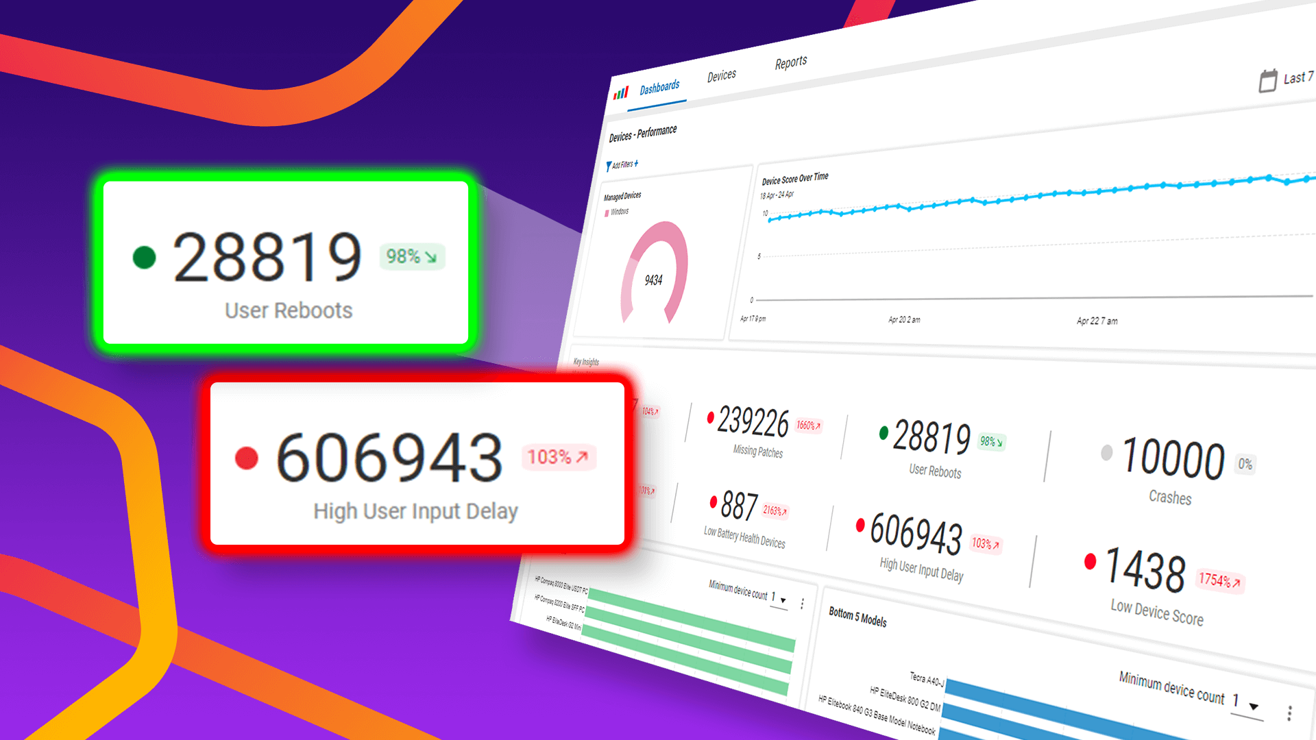
Devices Performance Dashboard
Blue Screens of Death (BSoD), application crashes, devices with high CPU usage, and increased user input delay cause users to become frustrated and lose productivity. To allow managers to quickly assess the performance of the devices and their users’ experience with those devices, Edge DX has a Device Performance dashboard (Figure 14). Using this dashboard, you can instantly identify issues in your environment.
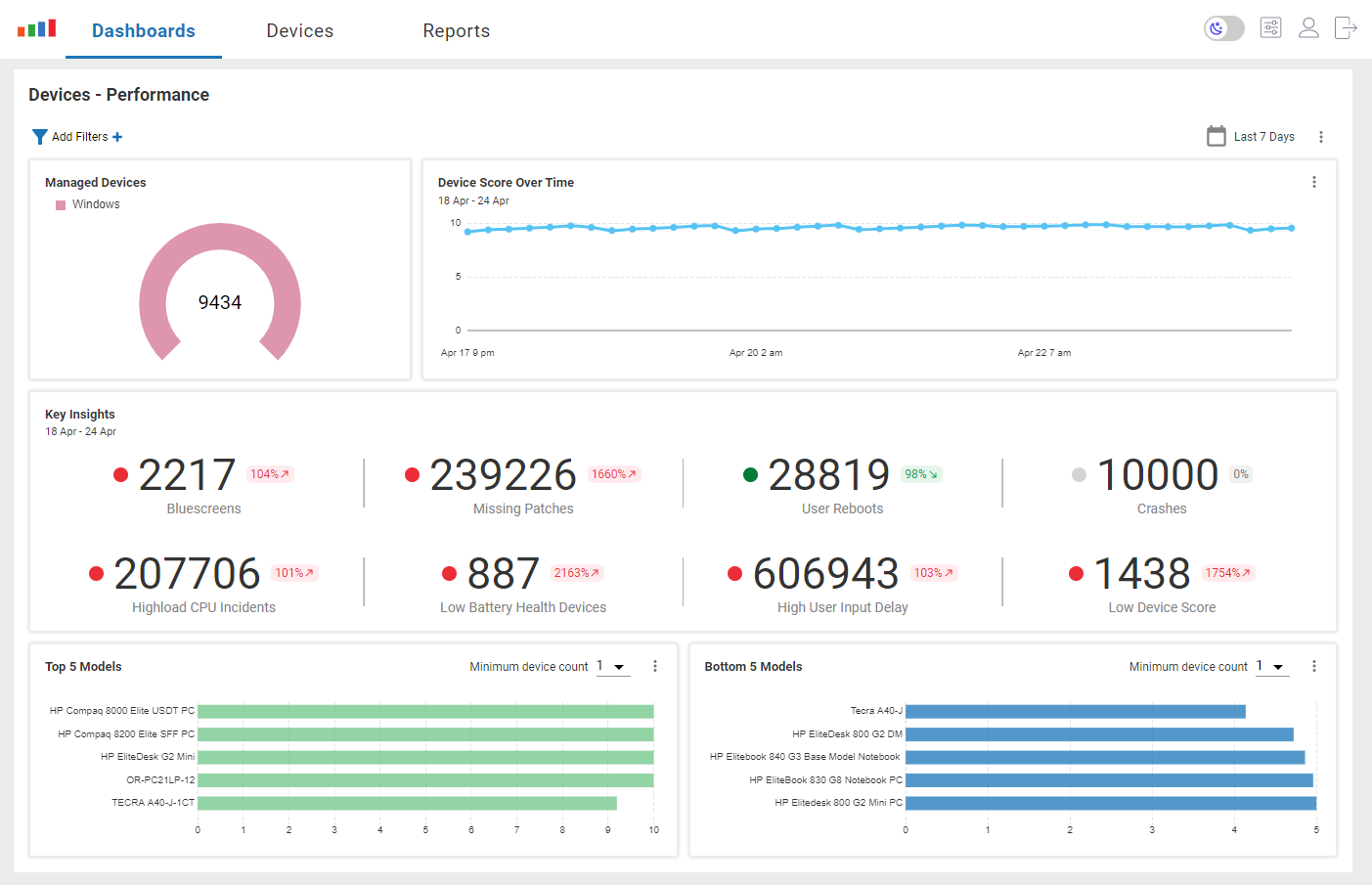
Figure 14: Device Performance Dashboard
Like all other dashboards, the device performance dashboard allows you to select the timeframe (Figure 15) you want to investigate. The timeframe is on the upper right of the dashboard.

Figure 15: Timeframe
To get more granular trending information, select a larger time frame. Select a smaller time frame to see issues that need immediate addressing.
The Device Score Over Time widget (Figure 16) lets you quickly check if you have any serious problems affecting your entire operation.

Figure 16: Device Score Over Time
This widget uses the device health score, which is a super-metric composed of many other metrics to indicate the overall health of your devices. If you see a marked drop off in the score, it indicates that something is affecting the health of your devices. I watch this widget after a major OS or application update. If I see a marked downturn in the score, it could indicate that something went wrong with it..
The middle row of widgets gives insights into your environment. It would help if you remembered that these widgets, for the most part, show the total number of events over the time frame that you specified. For example, 2231, as shown in the Bluescreens widget (Figure 17), seems excessive, but if you divide the number of events by the number of days, that is 317 BSoD per day. Again, this seems high, but when this is spread out over the nine thousand devices shows that only 3% of the devices on a given day experience them. Not a great percentage, but not quite as alarming as the raw number.

Figure 17: Bluescreens
To gather more insights clicking Bluescreens in the widget will bring you to a report (Figure 18) that specifies which devices experienced the BSoD.
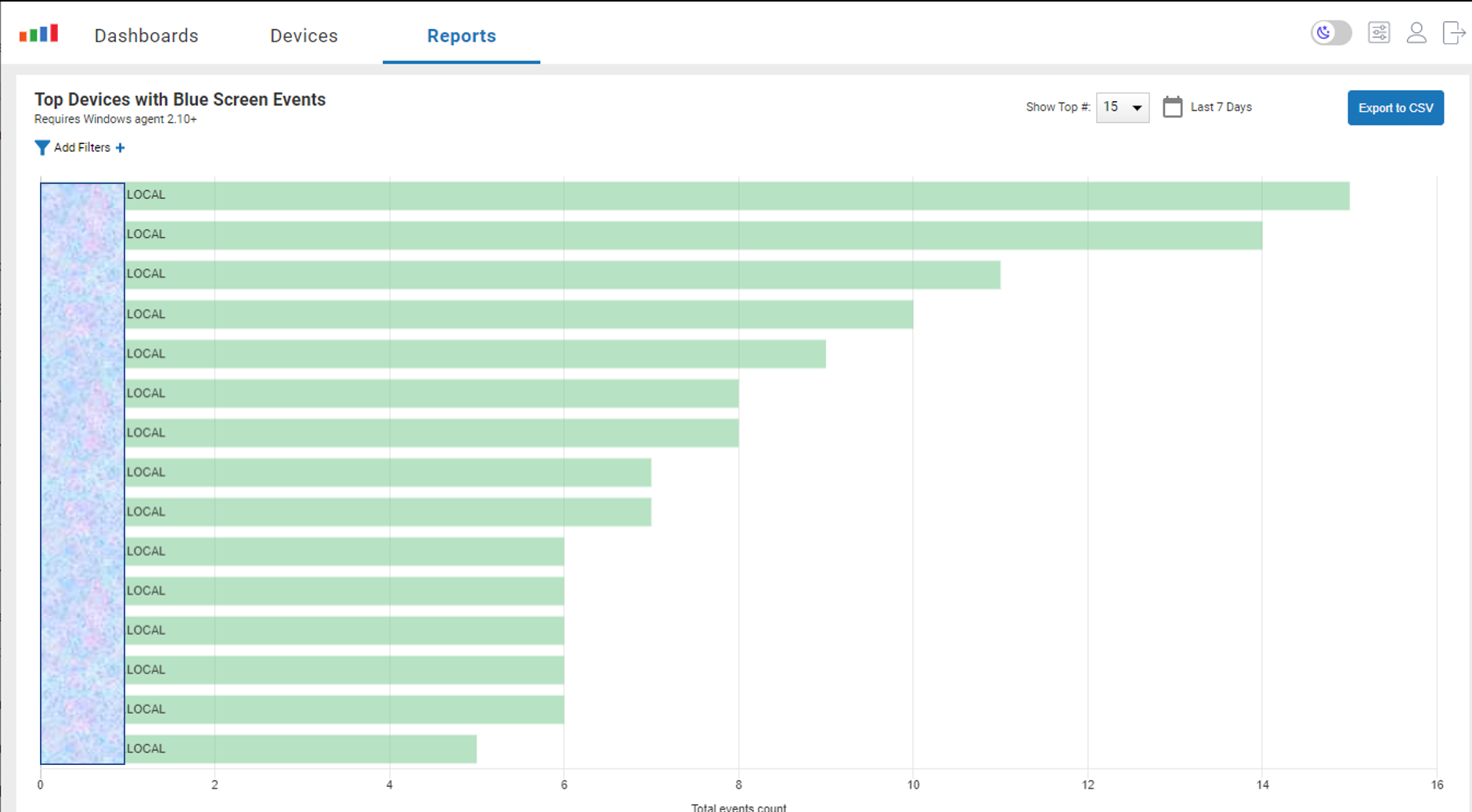
Figure 18: Bluescreen Report
Clicking the bar will bring you to the device’s home page (Figure 19) to investigate it further.

Figure 19: Device Home Page
Regardless of if you are having unexpected devices crashes, wondering if a new or updated application or OS is adversely affecting your users or the hundreds of other maladies that can adversely affect your environment, the Device Performance, Network Performance, and Application Performance executive dashboards give you a quick way to access the overall health of your environment and then, by using hot links, you can do a deep dive to find the specific devices that are causing these issues.
For more information, visit our Edge DX page or schedule a demo with a ControlUp sales engineer.