
Editor’s note: Update! Since the release of this blog article, ControlUp has released “Dashboards” — ControlUp’s data visualizer. Be sure to check it out!
ControlUp collects a vast amount of high-detail performance data, which you, as our customer, can seamlessly integrate into Power BI using our API. However, due to the sheer volume and quality of data we provide, it’s easy to reach our API’s line limit.
When this limit is exceeded, data may be missing from your Power BI report. Fortunately, we’ve implemented a simple yet effective solution: paging. By leveraging Power Query, you can create a dynamic query that automatically detects the number of pages and retrieves all available data, ensuring your Power BI dashboard remains complete and accurate. In this blog, we will share paging examples in Power Query.
In December, we launched our new API reference documentation (api.controlup.io/reference), which provides detailed guidance on generating your own API key and exploring our endpoints. Nearly all endpoints support paging, using the _page parameter to specify which page to retrieve and the _limit parameter to define the number of lines per API call.
By leveraging these parameters, we can create an automated Power Query that dynamically retrieves all available data, ensuring a seamless and complete integration with Power BI.
Automatic Paging with our Sessions Endpoint
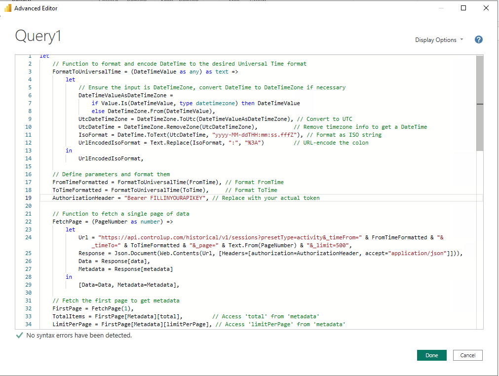
Our Sessions endpoint for VDI & DaaS (GetSessionsStatistics) provides detailed statistics for all user sessions. Given the high volume of data, it can easily exceed our 100,000-line API limit, making paging essential when integrating this endpoint into Power BI.
The Power Query below connects to the API, retrieves the total number of items, and divides this by the page limit to calculate how many pages need to be fetched. It then iterates through each page, collecting and combining the data into a single table.
This query relies on query parameters for date, time, and timezone, specifically the FromTime and ToTime parameters, allowing you to define a precise time frame for the data.
Important: On line 19, enter your API key to authenticate the request.
let

    // Function to format and encode DateTime to the desired Universal Time format

    FormatToUniversalTime = (DateTimeValue as any) as text =>

        let

            // Ensure the input is DateTimeZone, convert DateTime to DateTimeZone if necessary

            DateTimeValueAsDateTimeZone =

                if Value.Is(DateTimeValue, type datetimezone) then DateTimeValue

                else DateTimeZone.From(DateTimeValue),

            UtcDateTimeZone = DateTimeZone.ToUtc(DateTimeValueAsDateTimeZone), // Convert to UTC

            UtcDateTime = DateTimeZone.RemoveZone(UtcDateTimeZone),           // Remove timezone info to get a DateTime

            IsoFormat = DateTime.ToText(UtcDateTime, "yyyy-MM-ddTHH:mm:ss.fffZ"), // Format as ISO string

            UrlEncodedIsoFormat = Text.Replace(IsoFormat, ":", "%3A")         // URL-encode the colon

        in

            UrlEncodedIsoFormat,


    // Define parameters and format them

    FromTimeFormatted = FormatToUniversalTime(FromTime), // Format FromTime

    ToTimeFormatted = FormatToUniversalTime(ToTime),     // Format ToTime

    AuthorizationHeader = "Bearer APIKEYHERE", // Replace with your actual token


    // Function to fetch a single page of data

    FetchPage = (PageNumber as number) =>

        let

            Url = "https://api.controlup.com/historical/v1/sessions?presetType=activity&_timeFrom=" & FromTimeFormatted & "&_timeTo=" & ToTimeFormatted & "&_page=" & Text.From(PageNumber) & "&_limit=500",

            Response = Json.Document(Web.Contents(Url, [Headers=[authorization=AuthorizationHeader, accept="application/json"]])),

            Data = Response[data],

            Metadata = Response[metadata]

        in

            [Data=Data, Metadata=Metadata],


    // Fetch the first page to get metadata

    FirstPage = FetchPage(1),

    TotalItems = FirstPage[Metadata][total],         // Access 'total' from 'metadata'

    LimitPerPage = FirstPage[Metadata][limitPerPage], // Access 'limitPerPage' from 'metadata'


    // Calculate total pages

    TotalPages = Number.RoundUp(TotalItems / LimitPerPage),


    // Generate a list of pages

    PageNumbers = {1..TotalPages},


    // Fetch data for all pages

    AllData = List.Transform(PageNumbers, each FetchPage(_)[Data]),


    // Combine all data into a single table

    CombinedData = Table.FromList(List.Combine(AllData), Splitter.SplitByNothing(), null, null, ExtraValues.Error),

    #"Expanded Column1" = Table.ExpandRecordColumn(CombinedData, "Column1", {"username", "logoff_time", "user_full_name", "session_id", "login_time", "duration_in_seconds", "logon_duration", "session_protocol_latency_avg", "initial_program", "initial_client_ip", "logon_server", "user_ad_ou", "initial_client_branch_name", "session_protocol_bandwidth_usage_avg", "session_protocol_bandwidth_usage_max", "rtt_avg", "session_protocol_latency_max", "profile_load_time", "cpu_usage_avg", "gpu_cpu_utilization_avg", "memory_usage_avg", "desktop_load_time", "group_policy_load_time", "io_usage_iops_avg", "disk_read_kbyte_per_sec_avg", "disk_write_kbyte_per_sec_avg", "logon_duration_other", "active_time_percentage", "idle_time_percentage", "disconnect_time_percentage", "logoff_flag", "session_uid", "computer_id", "machine_name", "user_account"}, {"Column1.username", "Column1.logoff_time", "Column1.user_full_name", "Column1.session_id", "Column1.login_time", "Column1.duration_in_seconds", "Column1.logon_duration", "Column1.session_protocol_latency_avg", "Column1.initial_program", "Column1.initial_client_ip", "Column1.logon_server", "Column1.user_ad_ou", "Column1.initial_client_branch_name", "Column1.session_protocol_bandwidth_usage_avg", "Column1.session_protocol_bandwidth_usage_max", "Column1.rtt_avg", "Column1.session_protocol_latency_max", "Column1.profile_load_time", "Column1.cpu_usage_avg", "Column1.gpu_cpu_utilization_avg", "Column1.memory_usage_avg", "Column1.desktop_load_time", "Column1.group_policy_load_time", "io_usage_iops_avg", "disk_read_kbyte_per_sec_avg", "disk_write_kbyte_per_sec_avg", "Column1.logon_duration_other", "Column1.active_time_percentage", "Column1.idle_time_percentage", "Column1.disconnect_time_percentage", "Column1.logoff_flag", "Column1.session_uid", "Column1.computer_id", "Column1.machine_name", "Column1.user_account"}),

    #"Sorted Rows" = Table.Sort(#"Expanded Column1",{{"Column1.login_time", Order.Ascending}})

in

    #"Sorted Rows"
Let’s go over how to set up this Query within PowerBi.
- Open up PowerBi and click on Blank report

2. Click on Get data from other source ->

3. Scroll all the way down and click on Blank Query

4. In the bar, click on Advanced Editor.

5. Paste in the Query from above, and make sure to enter your API key in line 19. Then click on “done.”
6. This will give an error that the parameters are missing. We need to add them to the query.

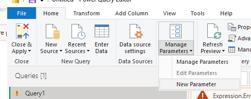
7. Click on Manage Parameters and Click New Parameter
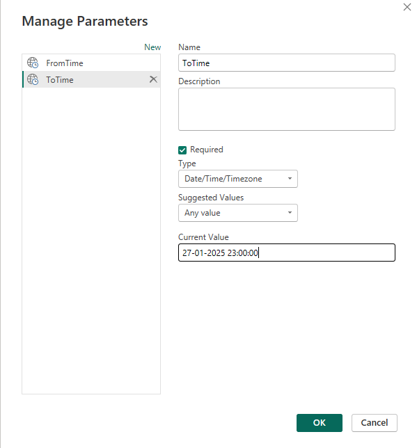
8. Create two parameters, one named FromTime and one named ToTime. Make sure both are of type Date/Time/Timezone, and fill in a date and time you want to collect from and to. For example, the FromTime can be 25-01-2025 01:00:00, and the ToTime can be 27-01-2025 23:00:00. This will show all sessions between these two dates. Click on OK.
9. The query should now work and provide all the data back when it goes through all the pages.

Automatic Paging with our Data Endpoint
Our Data Endpoint (Edge DX API – Get Data Index) can return a wealth of valuable data, as some indexes update as frequently as every minute.
In this example, we will connect to the device_status index, which contains a high volume of data and can easily exceed the 100,000-line API limit. To handle this efficiently, we will implement paging, ensuring all relevant data is retrieved seamlessly.
The Power Query below works similarly to our Sessions Query. It retrieves the total number of items, divides this by the items-per-page limit to calculate the total number of pages, and then iterates through each page to collect all available data. Finally, it compiles the results into a structured table for easy analysis in Power BI.
This query requires only a FromTime parameter, which can be set up in the same way as in the example above. Of course, you need to fill in your API key.
let

    // Convert FromTime to UTC

    FromTimeUTC = DateTimeZone.ToUtc(FromTime),

    FromTimeFormatted = DateTimeZone.ToText(FromTimeUTC, "yyyy-MM-ddTHH:mm:ss.fffZ"),


    // Base URL with filter directly embedded

    BaseUrl = "https://api.controlup.com/edge/api/data/device_status?filters[0][field]=_created&filters[0][type]=>=&filters[0][value]=" & Text.Replace(FromTimeFormatted, ":", "%3A") & "&size=500&page=",


    // Headers for authentication

    Headers = [Authorization="Bearer YOURAPIKEYHERE"],  // Replace with a fresh valid token


    // Function to fetch a single page of data

    GetPage = (PageNumber as number) as list =>

        let

            Url = BaseUrl & Text.From(PageNumber),

            Response = Json.Document(Web.Contents(Url, [Headers=Headers]))

        in

            try Response[rows] otherwise null,


    // Fetch first page to determine total pages

    FirstPage = Json.Document(Web.Contents(BaseUrl & "1", [Headers=Headers])),

    RowsAvailable = FirstPage[rows_available],

    PageSize = FirstPage[page_size],

    TotalPages = Number.RoundUp(RowsAvailable / PageSize),


    // Fetch multiple pages **without breaking authentication**

    Pages = List.Transform({1..TotalPages}, each GetPage(_)),


    // Combine all pages into one table

    CombinedData = List.RemoveNulls(Pages),

    FinalTable = Table.FromList(CombinedData, Splitter.SplitByNothing(), null, null, ExtraValues.Error),


    // Expand and structure data

    #"Expanded Column1" = Table.ExpandListColumn(FinalTable, "Column1"),

    #"Expanded Column2" = Table.ExpandRecordColumn(#"Expanded Column1", "Column1", {"_from_offline_cache", "created_local", "status_update_time", "battery_charge_remaining", "memory_total_bytes_used", "memory_total_bytes_available", "wifi_ssid", "wifi_bssid", "wifi_signal", "platform", "latency_target_1", "latency_result_1", "traceroute_result_1", "latency_result_2", "traceroute_result_2", "latency_result_3", "traceroute_result_3", "ping_avg", "foreground_app", "ping_final_local_ip_avg", "app_crashes", "app_hangs", "app_freezes", "app_freeze_seconds", "app_launch_times_avg", "public_ip_country", "public_ip_state", "public_ip_city", "tcpv4_connection_failures", "memory_available_percentage", "foreground_app_friendly_name", "ucc_active_app", "cpu_kernel_percentage", "console_user_upn", "foreground_url_domain", "foreground_web_app", "bsods", "hw_model", "os_name", "remote_address_isp", "rclient_name", "bytes_sent_since_last_interval", "bytes_received_since_last_interval", "bytes_sent_per_sec", "bytes_received_per_sec", "handlecount", "activesessions", "contextswitchespersec", "totaldiskqueuelength", "cpuload", "cpuqueuelength", "userinputdelay_max_long1000", "dex_score", "_created", "_created_local", "_device_id", "_device_name", "_id", "wifi_rssi", "latency_target_2", "latency_target_3"}, {"Column1._from_offline_cache", "Column1.created_local", "Column1.status_update_time", "Column1.battery_charge_remaining", "Column1.memory_total_bytes_used", "Column1.memory_total_bytes_available", "Column1.wifi_ssid", "Column1.wifi_bssid", "Column1.wifi_signal", "Column1.platform", "Column1.latency_target_1", "Column1.latency_result_1", "Column1.traceroute_result_1", "Column1.latency_result_2", "Column1.traceroute_result_2", "Column1.latency_result_3", "Column1.traceroute_result_3", "Column1.ping_avg", "Column1.foreground_app", "Column1.ping_final_local_ip_avg", "Column1.app_crashes", "Column1.app_hangs", "Column1.app_freezes", "Column1.app_freeze_seconds", "Column1.app_launch_times_avg", "Column1.public_ip_country", "Column1.public_ip_state", "Column1.public_ip_city", "Column1.tcpv4_connection_failures", "Column1.memory_available_percentage", "Column1.foreground_app_friendly_name", "Column1.ucc_active_app", "Column1.cpu_kernel_percentage", "Column1.console_user_upn", "Column1.foreground_url_domain", "Column1.foreground_web_app", "Column1.bsods", "Column1.hw_model", "Column1.os_name", "Column1.remote_address_isp", "Column1.rclient_name", "Column1.bytes_sent_since_last_interval", "Column1.bytes_received_since_last_interval", "Column1.bytes_sent_per_sec", "Column1.bytes_received_per_sec", "Column1.handlecount", "Column1.activesessions", "Column1.contextswitchespersec", "Column1.totaldiskqueuelength", "Column1.cpuload", "Column1.cpuqueuelength", "Column1.userinputdelay_max_long1000", "Column1.dex_score", "Column1._created", "Column1._created_local", "Column1._device_id", "Column1._device_name", "Column1._id", "Column1.wifi_rssi", "Column1.latency_target_2", "Column1.latency_target_3"})

in

    #"Expanded Column2"
We hope this information helps you use paging effectively to ensure your Power BI report is complete and includes all the necessary data. If you have any questions, feel free to reach out to Chris.Twiest@ControlUp.com.