
Edge DX is not only a great way to troubleshoot and remediate issues on endpoint devices, but it is also a fantastic way to collect and analyze data on them to gain further insights into your users and the PC on which they run. Using this data, you can see if specific devices or models are causing more issues and taking up more of your time. A prime example of this is the dreaded blue screen of death (BSOD) which prevents workers from completing their tasks or if certain programs or versions of programs are crashing on specific devices. Basically, you can see if there is a correlation between issues that users are experiencing. I do need to note that correlation does not mean causation, but it is useful to gain insights for further investigations to see if there is causation.
Edge DX dashboard does have reports on common issues. It also lets you create your own reports on issues that are unique to your environment. It also lets you export the data it collects so you can do offline analysis using other tools.
In this article I will show you how to use Excel, a program that most people already have on their PC, to aggregate and combine Edge DX data to gain some interesting insights into your desktop environment.
Gathering Data
Before we get into a deep, off-line analysis of your data let’s take a look at the data that Edge DX collects and how it is stored.
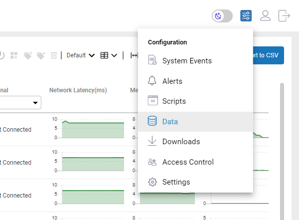
Edge DX uses a high-performance, cloud-based database to store the data that it collects from the devices that it monitors. It stores this data using various data indexes. The data indexes can be seen by selecting Data from the Configuration drop-down menu.
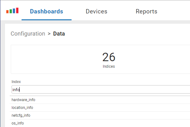
The index name is usually a good indicator of what information is stored in it. In my case, I want to see information about the hardware and OS that are running on my devices. This is in the hardware_info and os_info indexes.
Selecting hardware_info shows the columns that make up the index.

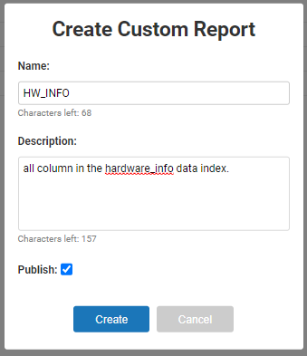
To do offline analysis of data using Excel you will need to export it. To do this select Create Custom Report. Give the report a name (i.e., HW_INFO), select publish and click Create. This will allow you to run, and the report to obtain the most current version of the data.
This report can be accessed by selecting Custom Reports under the Reports tab.
To export the data, click HW_INFO report and then click Export to CSV and save it to a folder on your local machine.

As I wanted to gain information about the operating system I followed the same procedure to export data from the os_information data index.
Aggregating the Data
Spreadsheets do not allow you to use common SQL statements to aggregate data but you can do this using Excel’s Power Query feature. Power Query was an add-on product in Excel 2010 and 2013 but has been an integral part of Excel since Excel 2016. If you are running a current version of MS Office, you have access to this powerful tool. I find it is a quick, menu-driven way to aggregate data. Below I will show you how I used it to create a pie chart that displays the various makes and models deployed in my environment.
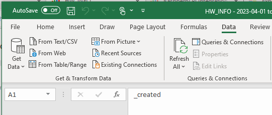
After opening the HW_INFO CSV file that I downloaded in Excel and saving it as a workbook I entered Power Query by clicking the Data tab on the Excel tool ribbon and selecting From Table/Range from the Get Data section.
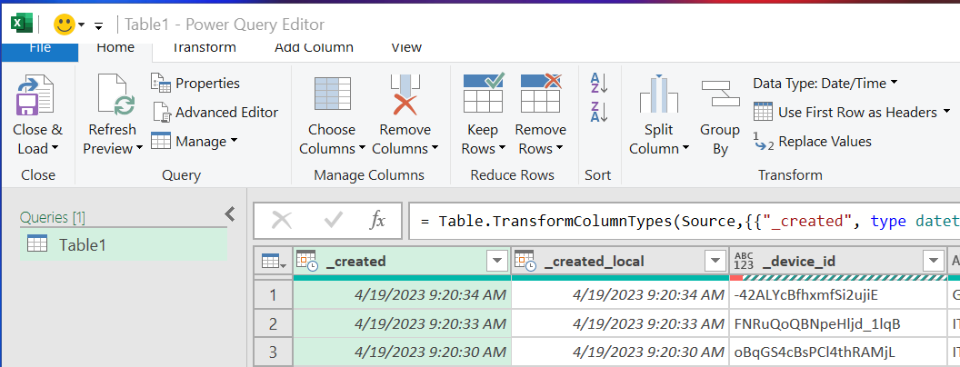
After clicking OK I was presented with the data in the Power Query Editor.
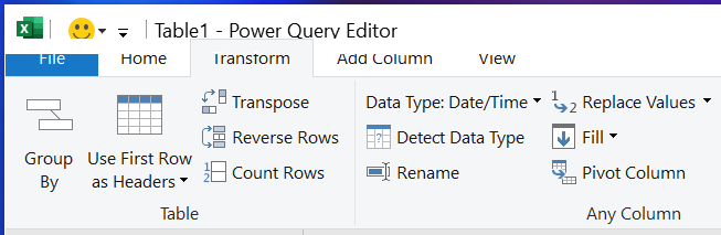
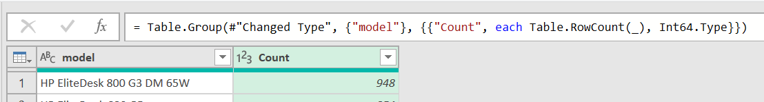
The first thing that I wanted to know was how many different types of devices we had. To see this information, I selected the Transform tab from the Power Query toolbar and selected Group By.
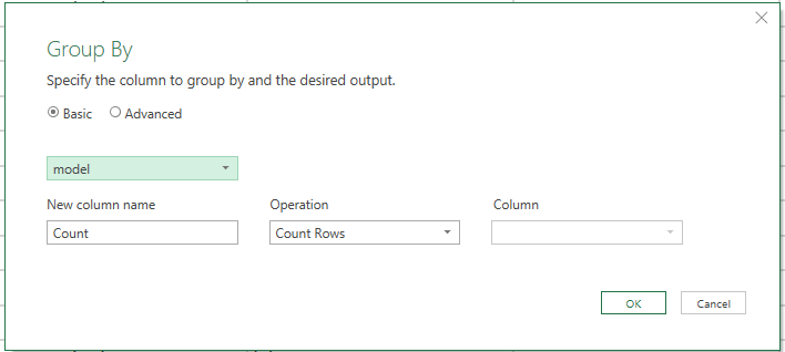
In the Group By wizard, I selected model from the drop-down menu.
I left the rest of the fields at their default value and clicked OK.
This displayed the number of models that were being used in this environment.

As a side note Power Query uses the “M” query language to create formulas. And you can see the code that was used to create the table.
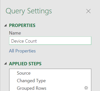
In the Query Settings dialog, I changed the name to Device Count.
I selected Close and Load from the File drop-down menu. This closed Power Query and loaded the results from the query as a new worksheet in my workbook.
I selected the new worksheet and calculated the percentage of each model. This will help me see if any issues are related to the percentage of devices.

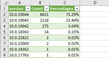
I imported the OS_INFO file into a separate worksheet and ran a similar Power Query query on the OSes running on the devices by the OSes patch level.
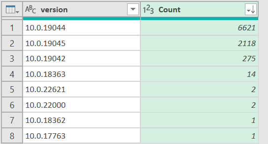
From this worksheet we see that over 73% of the devices are running Windows 10.0.19044.
This information is in Edge DX as the Operating System by Version Report, but In Excel, we can display this information as a pie chart and combine (join) it with other data to gain further insights.
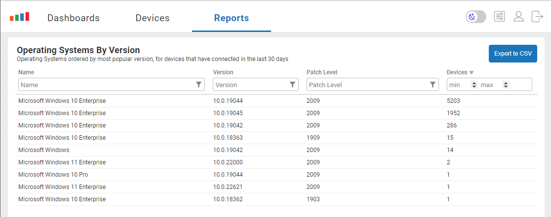
Acute observers may notice a slight difference in the numbers between the Edge DX and the Excel chart. This is due to the report running on real-time data and the Excel report having data collected over the entire month.
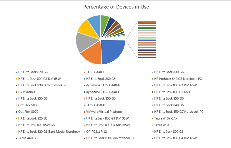
Using Excel, it is easy to create charts and graphs to visualize the data. For example, a pie chart shows the different models of devices in the environment.
Joining Data
Aggregating data can give some interesting insight into your environment but the real power of it is to see if there is any correlation between events. For example, you may wonder if a particular device is more likely to experience an OS or application crash. I can’t stress enough that correlation does not indicate causation, for example, different devices may have different workloads that may be causing issues, and the application on the device may be the problem, not the device itself.
As Edge DX follows a strict separation of data policy only the bare minimum amount of information is in each data index.
Before doing a join, a table needs to be made from the HW_INFO worksheet. I called this table HW_Table.
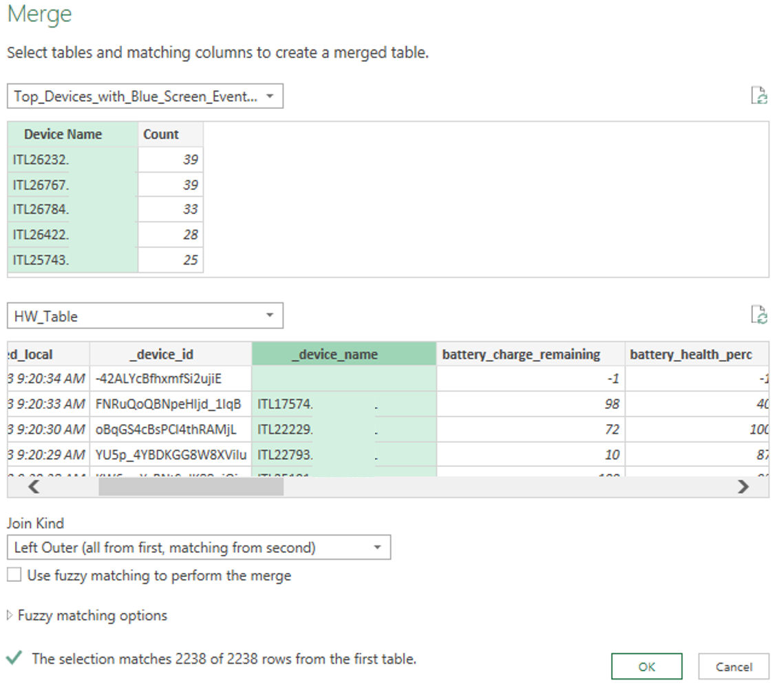
I ran the Top Devices with Blue Screen Events report and exported it as a CVS file and then imported it into my Workbook.
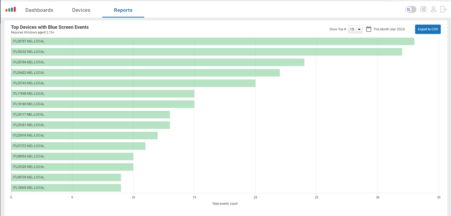
This report only has two columns, the device name, and the number of events.

Joining this with the hardware information will allow us to see what hardware the device is used on.
Selecting Data and then From Table/Range will bring it into Power Query.
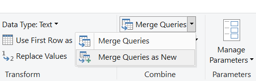
Selecting Merge Queries as New from the Merge Queries drop-down menu will bring up the Merge wizard.
In the Merge Wizard, I selected the blue screen table and the hardware information (selected from the drop-down menu), selected the matching fields (device name), and did a left outer join on them.
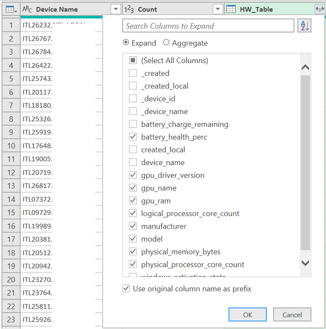
In this new table I selected the column I wanted to display.
I saved this as BSoD_HW_Crashes so I could run different queries on it.
I brought it back up in Power Query and grouped the number of crashes by the model and saved it as BSoD_HW_Crashes_HW-Model

I created a new column in the worksheet that calculated the percentage of crashes that each model had.
I then used Power Query to join this table with the Device Percentage table.
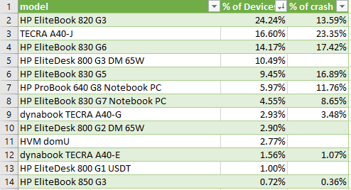
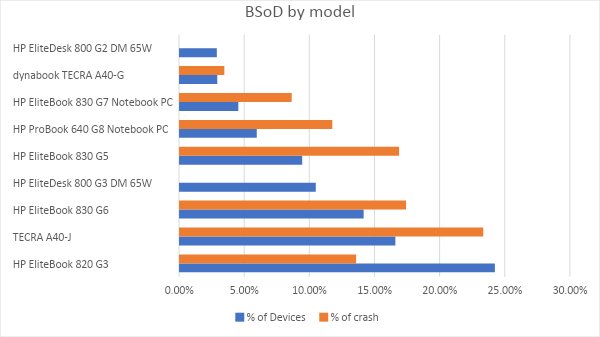
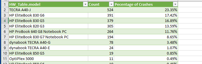
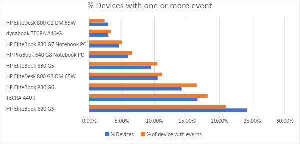
Creating a graph of the top 10 devices helps with the visualization of this data.
In an ideal world, the percentage of crashes would match the percentage of devices. This worksheet shows that the TECRA A40-J makes up 16% of the devices but accounts for 23% of the BSoD while the HP EliteBook 820 G3 makes up 24% of the devices but only accounts for 13 percent of the BSoD’s. Likewise, the HP EliteBook 830 G7 Notebook PC has half the BSoD’s that would be expected. The HP EliteDesk 800 G3 DM 65W, which accounts for 10% of the devices did not have any crashes.
A comparison of the Top Processes by Application Crash reports per device was also run.
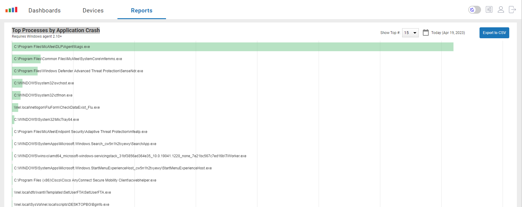
This report only contains the applications and the number of times an application failed.
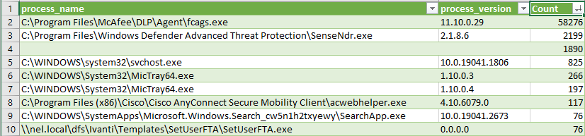
The data index win_event_log has a column called process_name of the process in the log. The event_level_name is also of interest. I created a report from this data, exported it out and imported it into Excel for further analysis.
After bringing it into Power Query I grouped it by process and then version.
To see if there was a correlation between the device that it was running on and the application, I did a join and grouping of it.
I then did a data join with the hardware and grouping of it by device name.

This showed that only a few devices accounted for a majority of the events. This was proven out in Edge DX by filtering by the device name it showed that over 10K error records came from this one device!

I was curious if the devices that had the issues had any hardware in common, so I Joined it with the hardware table. This did show that the TECRA A40-J was overrepresented, but I didn’t notice any other strong correlation between the events and devices.
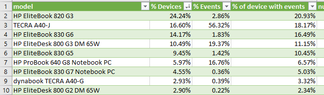
Graphing shows that the A40J is overrepresented regarding errors and the 820 G3 is underrepresented. This may not be an indication of faulty devices but the A40J’s may just see more use or use of problematic applications.

Using the data collected by Edge DX and an offline tool such as Power Query you can gain additional insights into your environment so you can focus on the issues and devices that need to be addressed.
See the other ways Edge DX allows you to gain unparalleled insight into your desktops!