
Today, Unified Communications tools—like Teams, Zoom, and others—are among remote workers’ most mission-critical applications. Monitoring and improving the user experience for these solutions is a top priority for IT teams, because when people have issues with these applications, productivity will be immediately impacted. But determining if problems are with the Unified Communications provider’s platform, the client application, the home network, or the endpoint device is often cumbersome.
This is why ControlUp’s dev team has been hard at work building Unified Communications monitoring capabilities into Edge DX, our physical endpoint monitoring solution, to give IT insights into usage and improve the digital employee experience for workers meeting and collaborating with Unified Comms (UC&C) tools.
In a series of recent articles, we’ve taken a look at how ControlUp for Desktops can monitor important unified communications (UC&C) tools to detect the root cause of issues impacting the user experience. In the first article, we looked at how help desk employees could look at information about Teams calls and meetings; in the second, we explained how you could examine what was happening on the device at the same time as the call. In the third, we explored how you can use proactive synthetic testing to ensure UC&C applications are available when your distributed workforce needs them.
Although day-to-day monitoring is of tactical importance, managers and executives need to take a more strategic look at UC&C applications to better understand how they impact an entire business and not just individual users. In this article, we’re going to look at how Edge DX graphs, widgets, and reports can help provide this perspective.
By going to the Unified Communications & Collaboration dashboard, a manager can gain a general understanding of their unified comms environment in terms of how it is performing and whether it has any pressing issues that need to be addressed.
For instance, in the screenshot below, we can see that 371 calls or meetings took place during a particular month for a total duration of 15.4K minutes; from this data, we can ascertain that Teams is being heavily used.
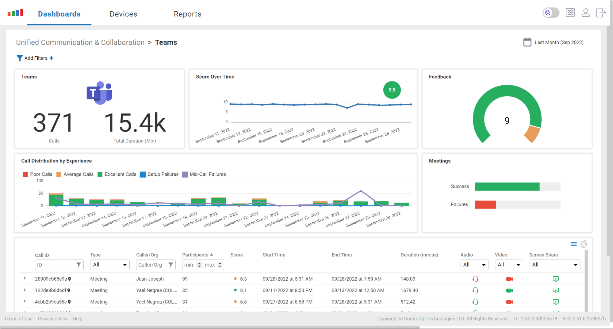
However, by going one step further and pointing to the Failures graph bar in the Meetings widget, we can see that 91 of the 280 meetings that took place ended in failure. This is clearly an issue that should be investigated further.

In the Call Distribution by Experience widget, we see a spike—59 in total—in mid-call failures on Sept 27. This does not appear to be an isolated incident, but a general failure, affecting many employees, that should also be investigated.
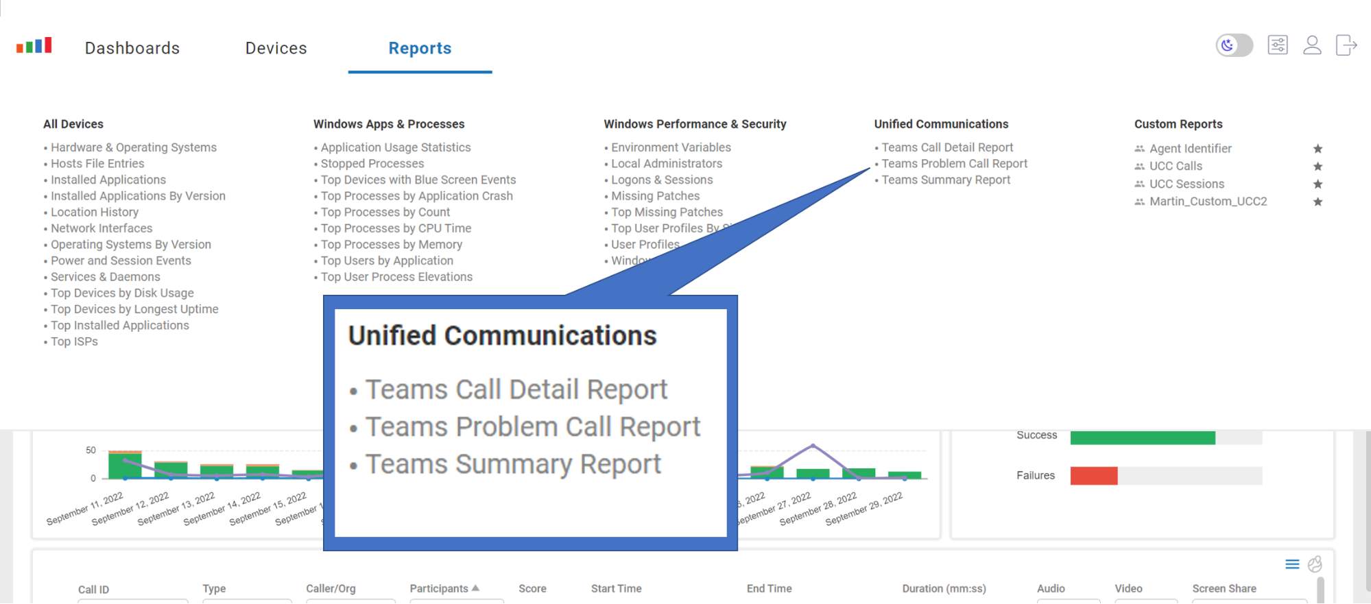
Under the Reports tab in the Unified Communications menu, there are pre-configured reports that can give finer-grained insights into what is going on with your UC&C applications and the employees that use them.
For example, by using the sortable feature in Edge DX, we can take a look at who had the longest Teams call by sorting on the Duration column after running the Teams Call Detail Report.
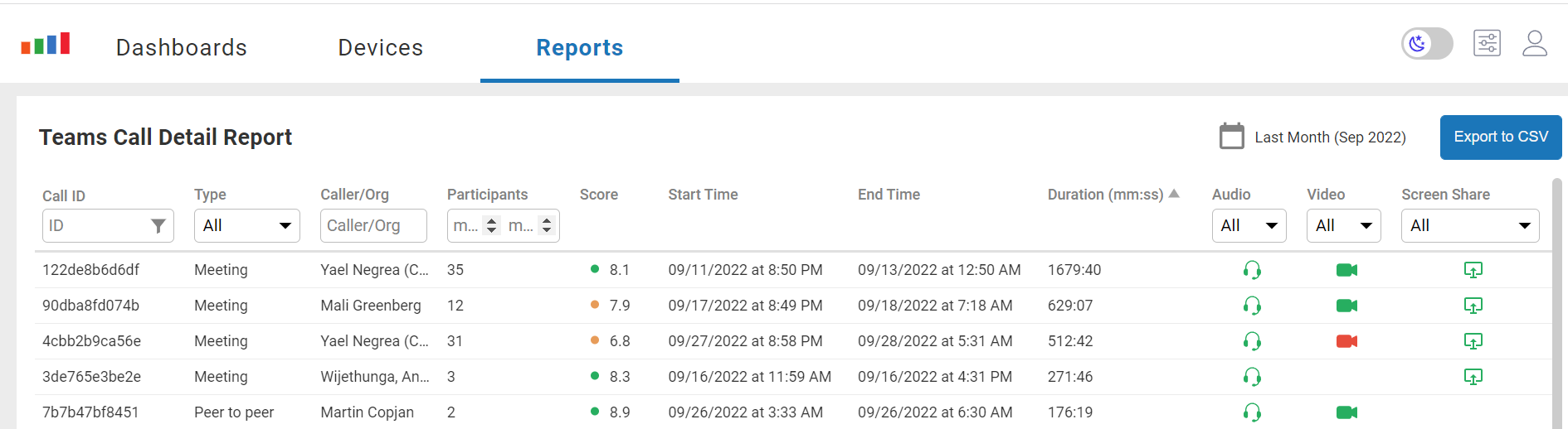
If multi-dimensional analysis is needed, the information in this report can be exported via CSV to a spreadsheet or to a database.
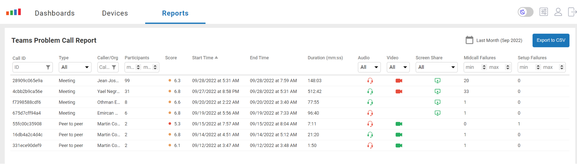
Managers often need an overview of pressing issues that must be addressed, and the Teams Problem Call Report was designed to do this. Front-line managers often run this type of work on a weekly or daily basis as it gives visibility into pressing issues that workers need to be assigned.

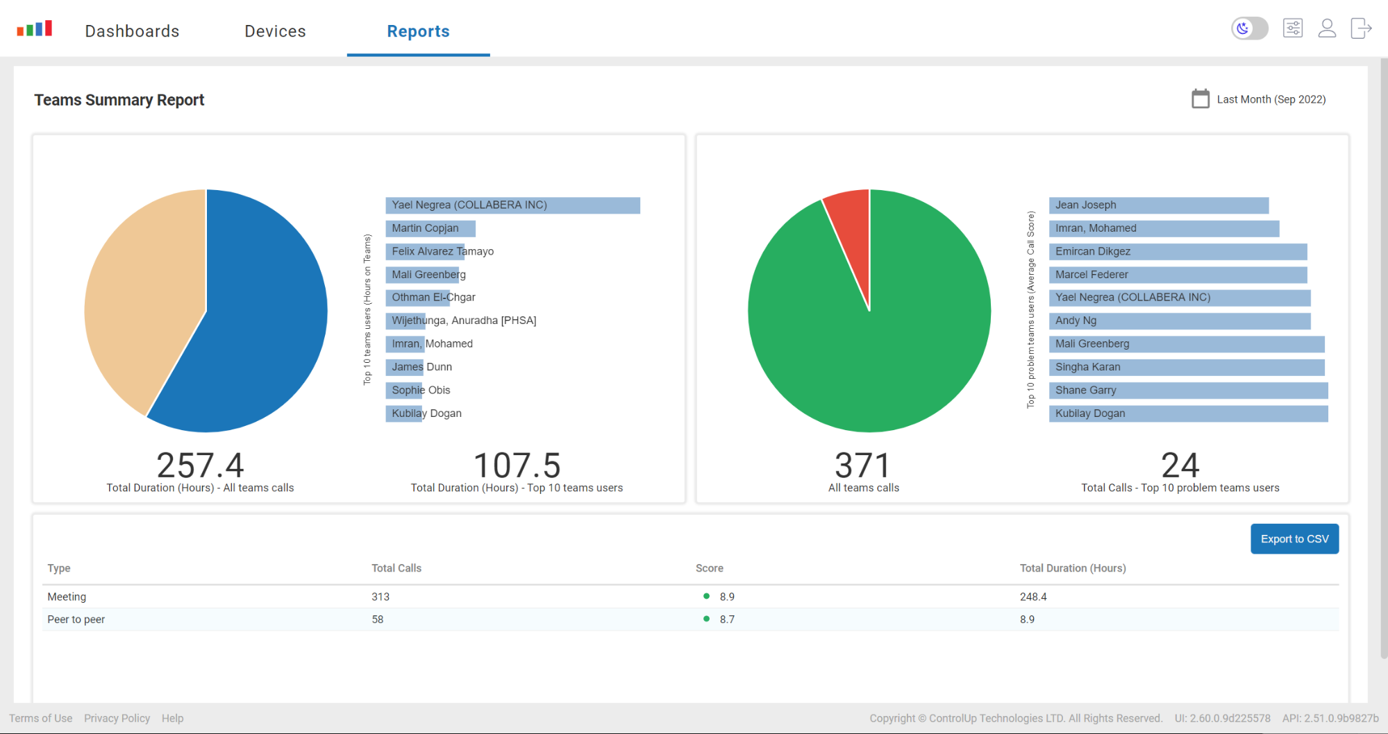
While the previous two reports were grid-like in nature, some information is better when consumed in a graphical format. The Teams Summary Report shows the users who have had the most problems and those who have used the UC resources the most. It also provides a summary of UC calls broken down by meeting and peer-to-peer calls.
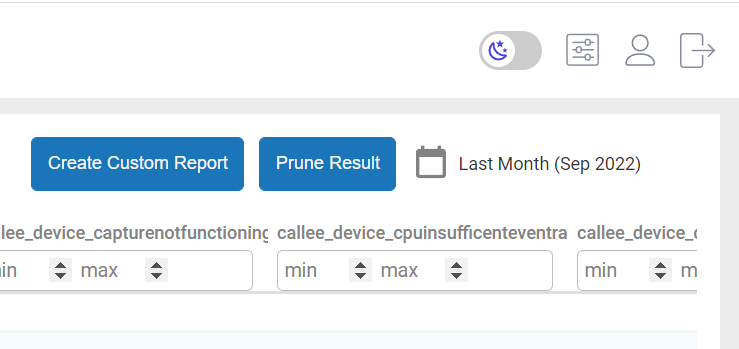
Of course, each company’s needs are unique, so Edge DX can provide custom reports based on the Teams data that it stores by selecting Data from the Configuration drop-down menu.
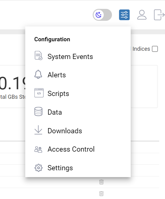
From here, you can create a custom report that shows the information that you need.
Given today’s reliance on Unified Communications applications in the workplace, we need to find better ways to digest its implications; managers and executives must be able to access information about these tools quickly and conveniently in order to make decisions that affect their workforce. Through various mechanisms, ControlUp Edge DX makes it easy for everyone, from front-line managers to executives, to do just that.