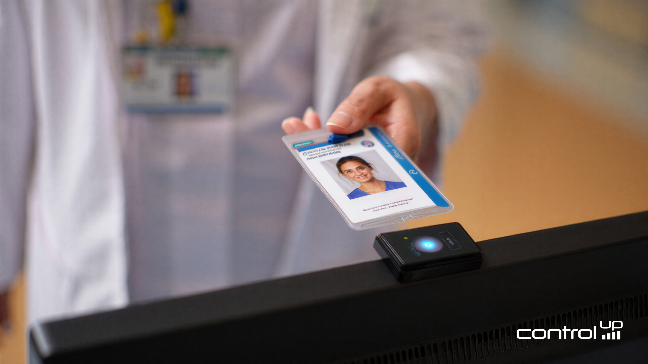
When staff move between devices, clinical areas, workstations, or shared endpoints, every second spent waiting for applications or desktops to appear matters. Tap to App helps teams understand exactly how long users wait from the moment they tap their badge to the moment their app or desktop is ready.

This article explains the two key timing scenarios to understand: logon, which typically takes longer because a full Windows session and application launch must occur, and reconnect, which happens more frequently as users move between machines and resume an existing session. For example, the first badge tap of the day may require a full logon, while later taps may simply reconnect the user to an existing session as they move between workstations.
I’ll walk through the Tap to App dashboard, show how to filter and interpret the data, and explain what each timing stage represents so you can better understand the end-user experience from badge tap to application readiness.
How to use the Tap to App Dashboard
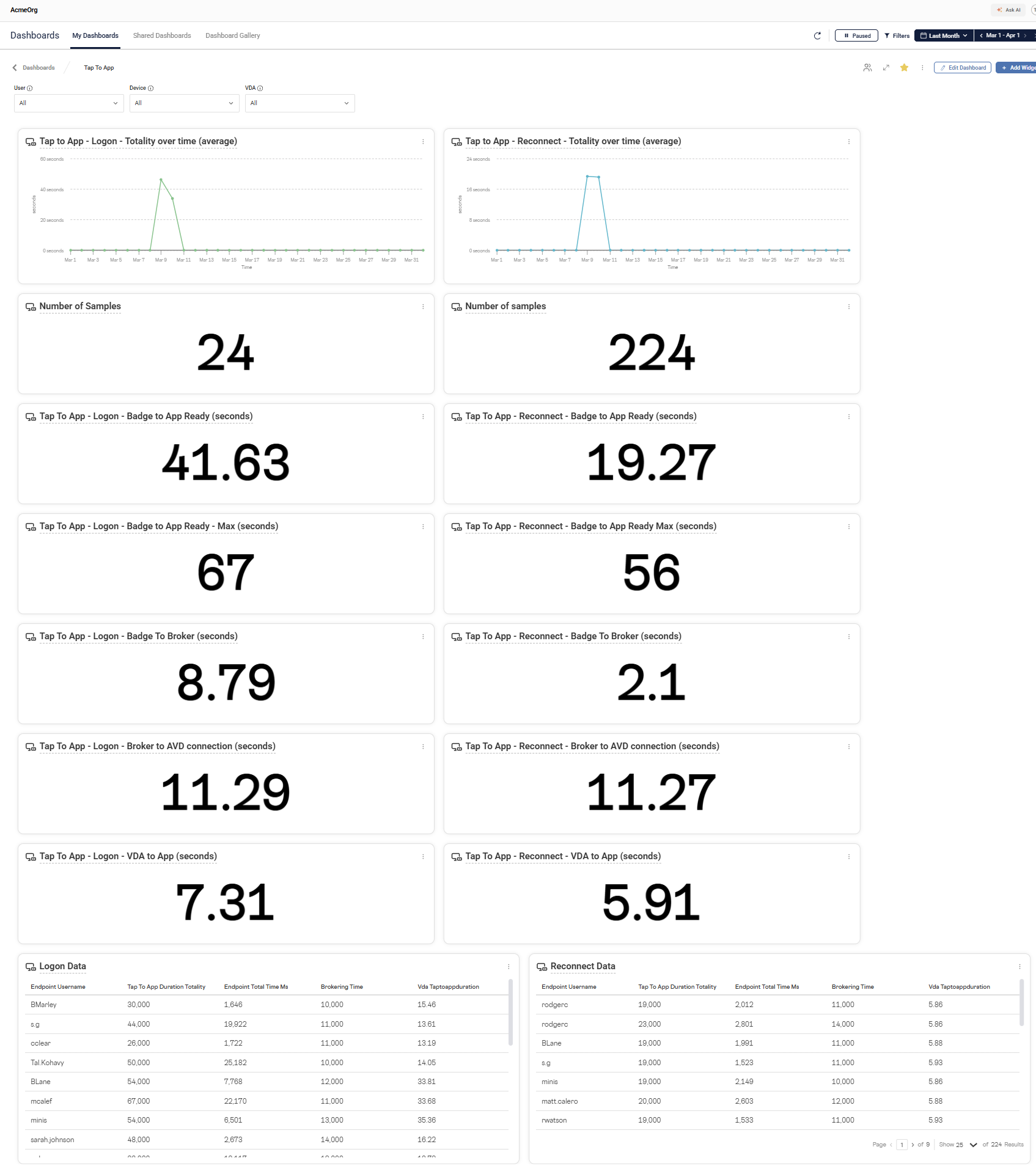
Once data is collected by ControlUp, you can view the data in The Tap to App dashboard. It has the following features to slice and dice your data:
- The ability to filter on multiple properties (User, Device, VDA)
- Time range
- Endpoint device properties (eg, City, State, Country, Device Tag, Device Group, etc)

Slicing and dicing the data
Data Properties
The Tap to App dashboard provides the ability to filter the data based on properties within the dataset. When you select a data property to filter you get a search field for free-text search, or a list of the first 50 found properties.
The data points available to filter are:
“User” — the user name of the person who started the session

“Device” — the name of the endpoint where the badge-tap occurred

“VDA” — the name of the server the user is connected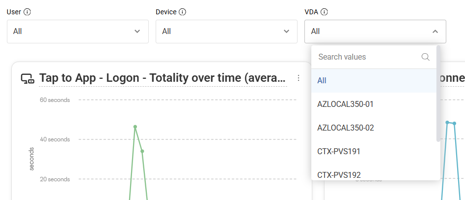
Endpoint Properties
The endpoints that are recorded have metadata associated with them that ControlUp can further filter.

You can filter on multiple different properties of the endpoint device. You can filter for devices that reside in a specific city, state, country or via other metadata like a Device Tag. By organizing your devices via tags you could get exceptionally precise in your filtering. For example, if you are a geographically dispersed organization and wanted to look at all endpoints in Emergency Rooms in a particular city you could filter on “City” and “Device Tag” is “ER” (or whatever you have tagged).
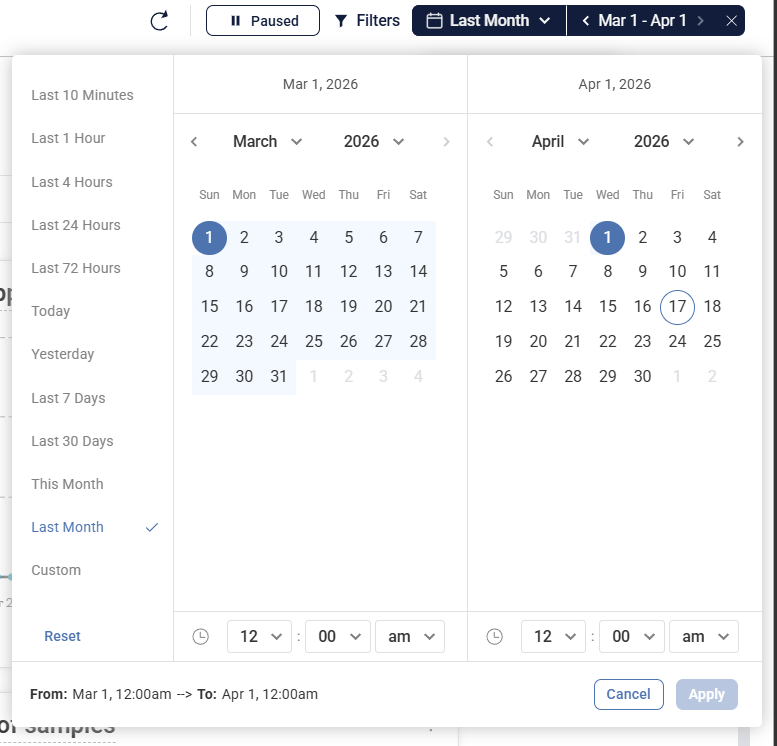
Time Range
The ControlUp Dashboard’s feature allows you specify a time range for the data to be displayed. When combined with the aforementioned filtering capabilities, you can specify enough context to follow an individual user, from their first logon to subsequent reconnects made throughout the day.

You can click on the date/time selector and choose a preconfigured amount of time to filter or select “Custom” to provide a specific date/time period.
What each column means
The Tap to App Dashboard is broken out into two columns with several rows. The left column (highlighted in yellow below) are the ‘logon’ events. The right column are ‘reconnect’ events.

What each row means
Each widget has been given a title to try and provide a brief description of their contents, this document will expand on it further. First, a visualization of the process:
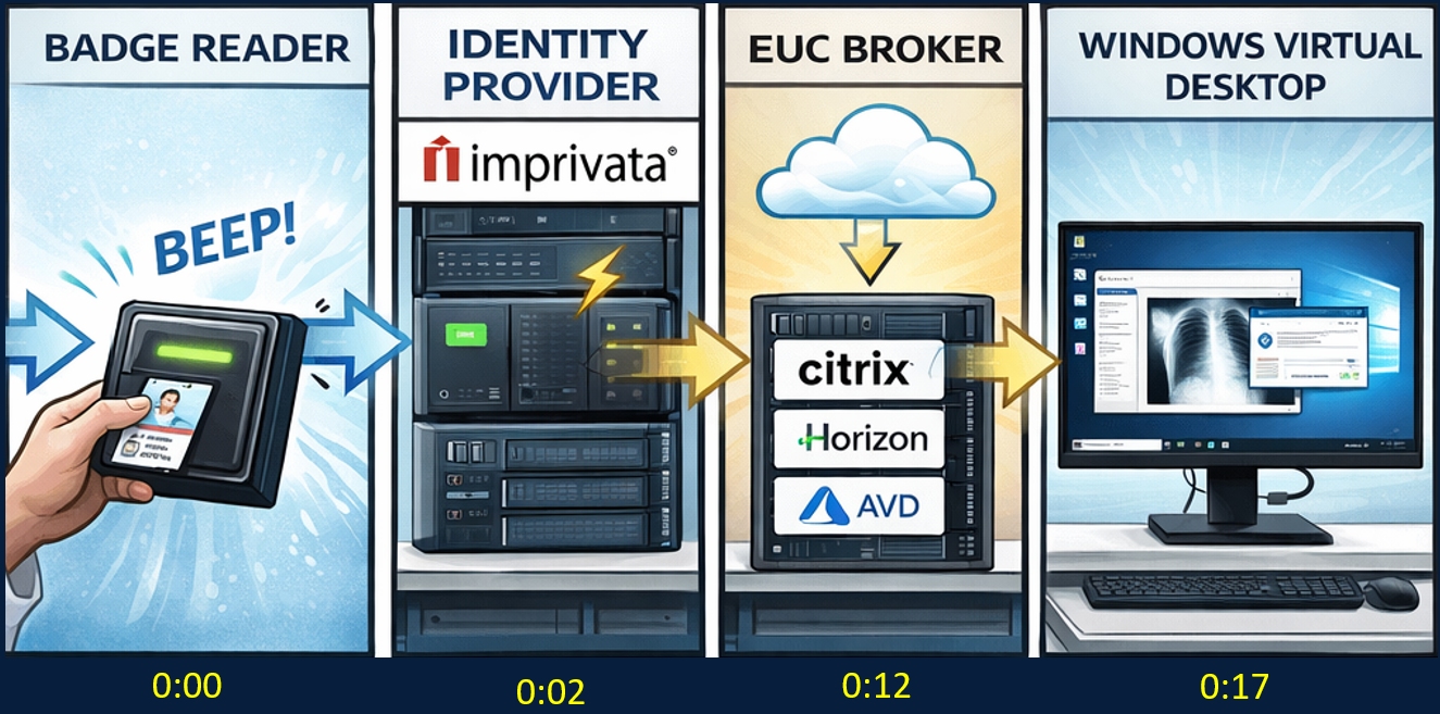
Tap to App Totality visualization
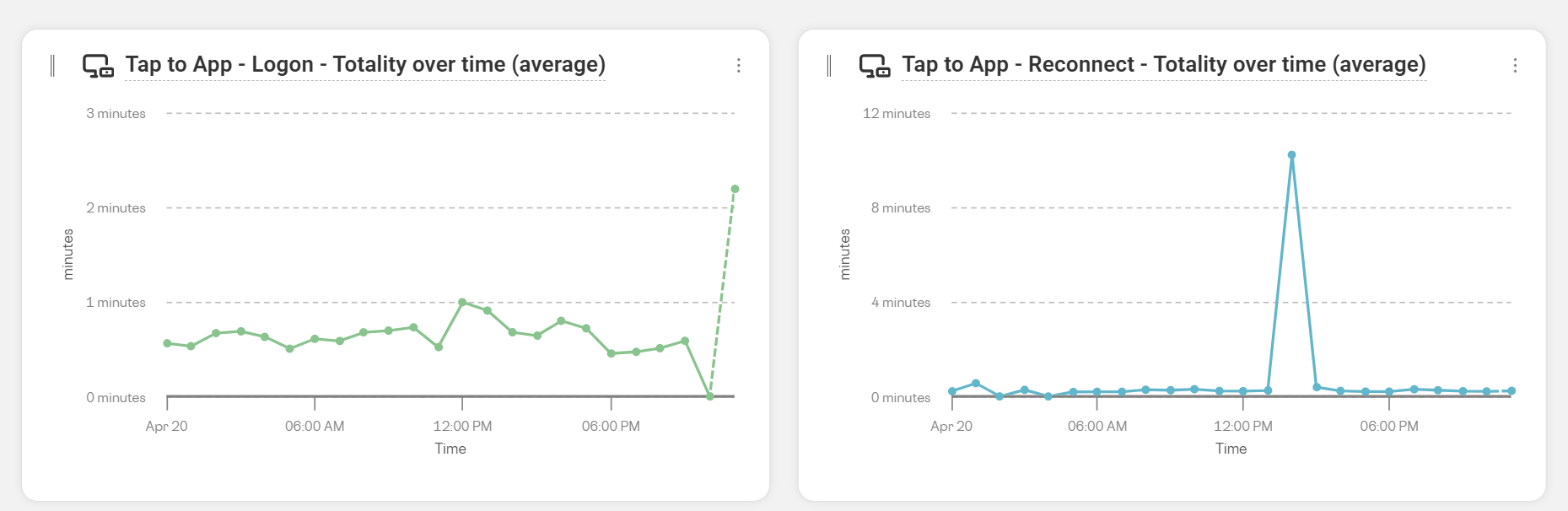
Number of samples and average of totality
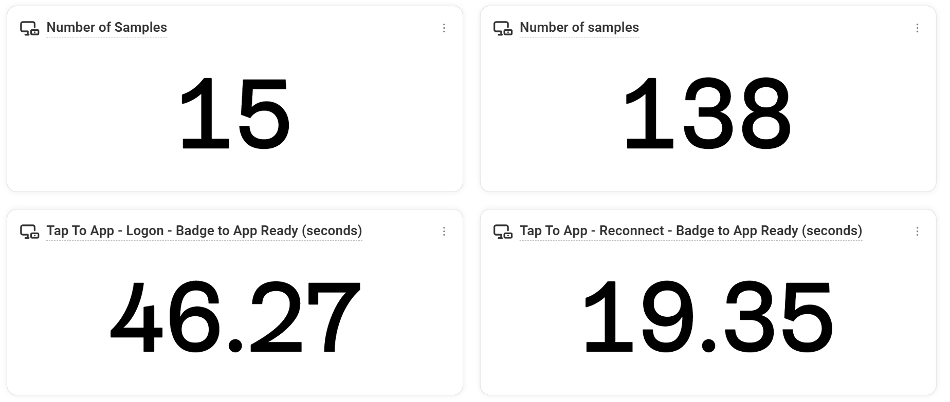
These widgets are the number of samples and then the average of the tap-to-app data for each scenario.
Tap to App – Badge to Broker
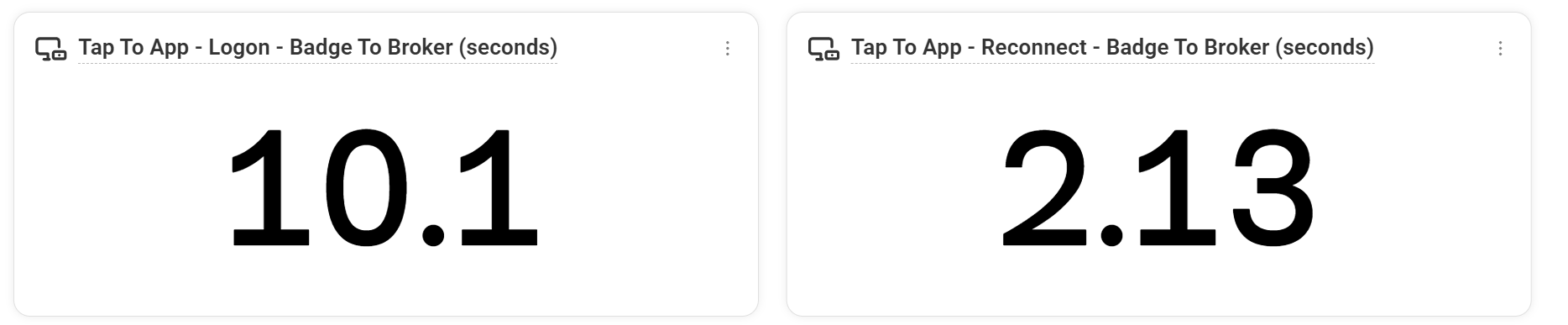
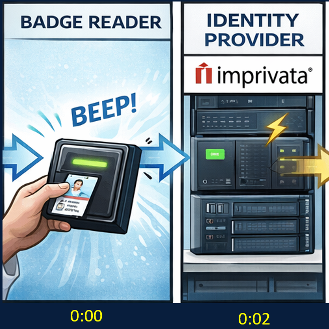
Badge to broker represents the stage as depicted in the image. It is the amount of time from when the ‘badge’ tap is detected to when the IdP has completed the brokering process.
What a high value means here: Possible badge reader, identity provider, authentication, or brokering delay
Tap to App – Broker to EUC connection

This stage represents when the IdP completed, the EUC broker is queried and the session is directed to an existing session (reconnect) or a machine is found to take a new connection (logon)
What a high value means here: Possible EUC broker, session lookup, machine assignment, or connection routing delay
Tap to App – VDA to App/Desktop Ready


This row shows how long it took from when the connection was received by the VDA to when the desktop/app is ready (logon) or when the image is being sent to the endpoint (reconnect).
What a high value means here: It depends on whether this is a logon or reconnect. Normally, logons will have a higher value than reconnects. Logons go through a slower process, processing the user’s profile, group policy, and other flows. Reconnects, on the other hand, should be much faster than logons. A high reconnect value here means that something is delaying when a user reconnects to a session to when the image starts getting remoted to them.
Tap to App – The users journey

The last widgets are the snapshot of the data of the user’s journey. Each individual tap-to-app duration can be reviewed in this chart.
Understanding Tap to App timings gives IT teams a clearer view into the real user experience. By separating full logon events from reconnect events, teams can identify where delays occur, whether during badge detection, brokering, EUC connection, or the final app and desktop readiness stage.
The Tap to App dashboard makes it easier to slice the data by user, endpoint, VDA, location, device tags, and time range, helping teams follow an individual user journey or analyze broader performance trends across the environment.
With this visibility, organizations can better measure staff wait times, troubleshoot delays, and improve the overall experience for users who depend on fast, reliable access to their applications and desktops throughout the day.
To get Tap to App setup for your organization, reach out to us and we can enable it for your environment.